



Website Design Mockup: How to Build One Step by Step.
Learn how to create a website design mockup, from wireframes and fidelity levels to file formats, accessibility checks and developer handoff.
Website Design Mockup: How to Build One Step by Step.
A website design mockup is the visual and interaction plan for real pages, not a finished website, and choosing a design tool shouldn't be your first decision. Founders, marketers and new designers need to decide what the mockup must prove before spending time making it look finished.
Key Takeaways Before You Open a Design Tool
- Settle decisions before code: A mockup should resolve layout, content and intended behaviour so developers aren't left to invent the experience.
- Start with a wireframe: Agree the structure while changes are cheap, then invest in typography, colour and imagery.
- Follow the riskiest journey: Prioritise enquiry, booking or checkout rather than polishing a homepage that doesn't prove users can complete their task.
- Design accessibility from the first sketch: Attractive screens can still conceal weak contrast, missing labels and unusable keyboard interactions.
- Prepare usable handoff files: Named layers, reusable components, design values and a clickable prototype help developers implement rules rather than guess from screenshots.
- Record approval in writing: A decision log establishes what's agreed, what remains uncertain and who can approve changes.
Build in that order, and judge readiness by whether the proposed experience works, not whether the presentation looks complete.
Choosing Between Wireframe, Mockup and Prototype
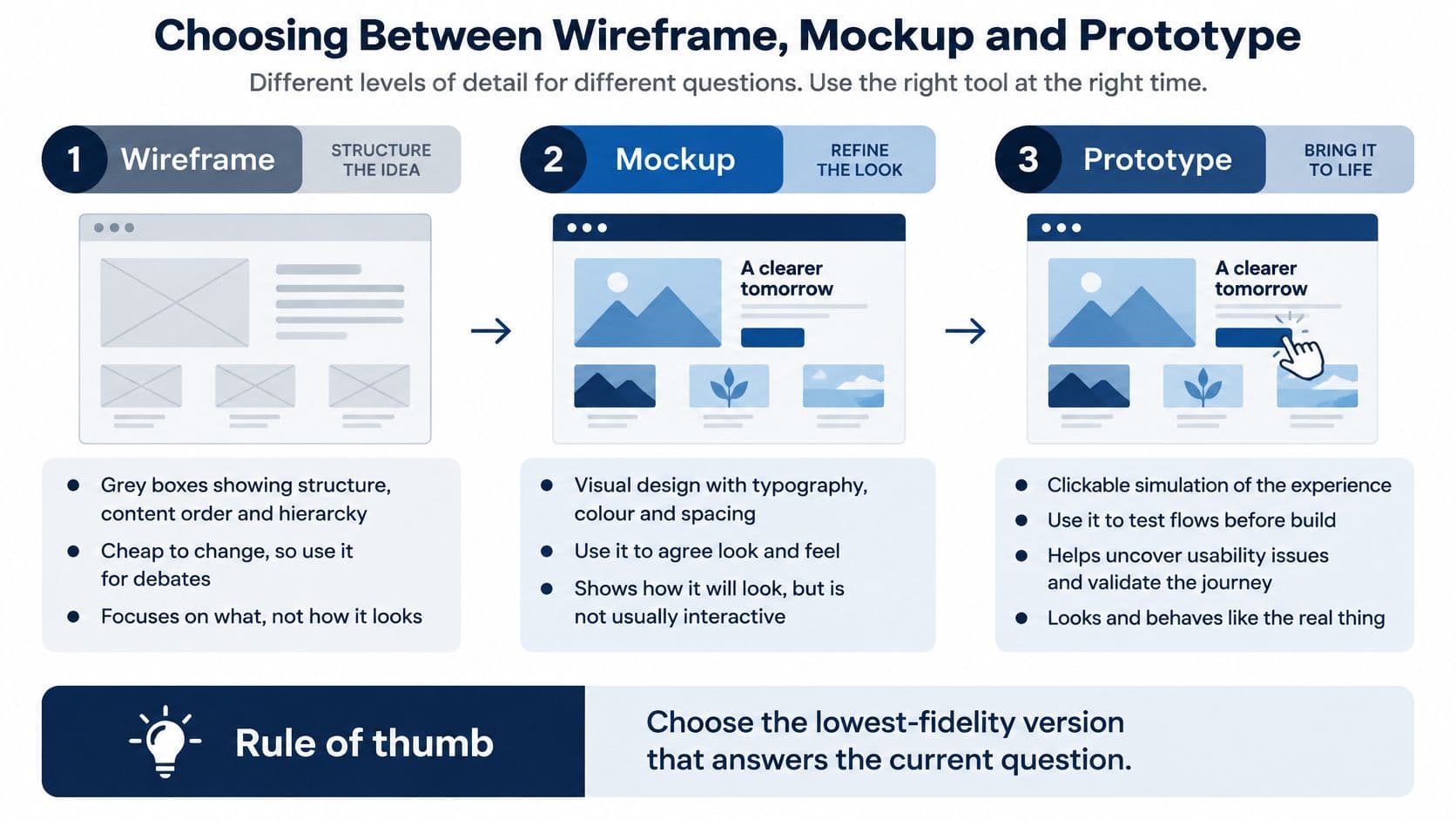
Choose the lowest fidelity that answers the current question. A debate about content order doesn't need brand photography, and a debate about checkout behaviour won't be settled by a static image.
Match the deliverable to the decision
- Wireframe: Grey boxes establish structure, content order and hierarchy. Use them to discuss navigation, page sections and what deserves prominence before scrolling. They're cheap to change because nobody has invested in finished styling. Keep meaningful labels inside the boxes, though. A rectangle labelled “content” doesn't help anyone decide whether the information belongs there.
- High-fidelity mockup: Static screens show colour, typography, spacing, imagery and real copy. Use these to agree visual direction after the structure is settled. They help stakeholders judge whether the interface feels credible and whether important content stands out. They don't prove that a dropdown, validation message or checkout sequence works.
- Prototype: Connected screens simulate a journey so someone can attempt a task. Use a prototype for account creation, conditional forms, navigation and other interactions where sequence matters. Build the branches that could change the design decision; don't connect every footer link merely to make the file appear thorough.
Don't confuse visual detail with confidence
Say you're designing a booking enquiry. A wireframe can settle whether users choose a service before entering their details. A mockup can establish the prominence of availability information. A prototype can reveal whether users understand what happens after submitting.
Polishing the first screen before resolving that sequence makes every structural revision more expensive. Stakeholders also become attached to finished artwork, making necessary changes harder to discuss.
Practical rule: Wireframes settle content, mockups settle look and feel, and prototypes test interaction when interaction is the risk.
Our approach to prototyping in design connects these deliverables rather than treating them as separate presentations. At Arch, Product Design on days 3–5 produces user flows, wireframes, a high-fidelity clickable interactive prototype and UX validation.
In UX and UI design, we design screens in high fidelity and wire them into a prototype clients can tap through before production code exists. The useful order is wireframe first, mockup second, then a clickable prototype when the riskiest journey needs testing.
How to Build a Website Design Mockup Step by Step
A useful website design mockup makes uncertainty visible. Each step should settle a decision and expose something that could otherwise become expensive during development.
Establish the task and structure
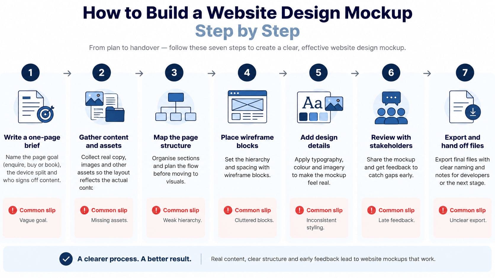
- Write a one-page brief. Name the page goal, such as enquire, buy or book, along with the audience, expected device split and content approver. Record assumptions if analytics aren't available. Skipping this turns later disagreements into personal preferences because nobody has defined success.
- Map the user flow on paper. Trace the route from entry point to completion, marking decisions, exits and recovery paths. For a booking flow, include unavailable dates and failed submissions. Missing screens should surface here, not when a developer asks what happens next.
- Sketch grey-box wireframes. As a starting exercise, use a 1280px desktop frame and a 375px mobile frame, then investigate widths between them. Time-box this work to hours rather than days. The common slip is refining boxes that will move once someone challenges the hierarchy.
- Replace placeholders with real content. Add actual product names, meaningful button labels and images at their intended aspect ratios. Test a three-word headline against a fourteen-word alternative rather than assuming the shortest copy represents every page. Don't approve a layout that depends on content nobody can supply.
Add rules, states and connections
- Set the visual system. Define the type scale, contrast-checked palette, spacing grid and component states. A button needs default, hover, focus and disabled treatments; a field needs error behaviour. Designing only the default state leaves developers to make consequential design decisions during implementation.
- Build the high-fidelity page types. Work from reusable components rather than independently styling every screen. Include empty results, loading, validation failures and unavailable content. A populated dashboard proves little about what a new user sees before adding anything.
- Connect the main journey. Link the screens, include recovery routes and annotate responsive behaviour and intended focus order. Don't make the entire screen clickable to disguise missing interactions. Someone should be able to identify the actual control and predict its result.
At Arch, the design stage turns the scope into a clickable prototype so clients can change their mind before the build becomes expensive to change. That freedom matters most when the prototype still exposes alternatives, rather than presenting a finished direction as inevitable.
Finish with an outsider check: can someone unfamiliar with the project complete the main task without asking you what to click? If you have to explain the interface, record the problem instead of coaching them past it.
Tools and File Formats That Make Handoff Smooth
Figma suits shared team files, comments and built-in prototyping. Sketch makes sense for Mac-focused teams with established libraries, while Penpot gives teams an open-source option they can self-host.
Choose around the people maintaining the files, not the tool with the most impressive demonstration. Legacy PSD files still appear in older projects, but they're a poor primary handoff format because their layer structure rarely maps cleanly to interface components.
Export a package, not a pile of screenshots
- PNG previews: Supply 1x and 2x exports where useful for stakeholder review, clearly labelled as references rather than implementation specifications.
- SVG assets: Export icons, logos and simple illustrations, checking cropping, strokes and unnecessary embedded elements.
- Annotated PDF: Preserve the approved screens and decisions in a document that doesn't depend on access to the design workspace.
- Design tokens: Provide JSON or CSS values for colour, spacing, type and border radius, using consistent names.
- Live prototype: Share a view-only link and confirm that recipients can open it without requesting access.
The common failure is exporting flat images without values or behaviour notes. Developers then measure screenshots and recreate components inconsistently.
Our explanation of what a design system is helps distinguish reusable interface rules from a collection of attractive screens. For teams comparing familiar design environments, SubmitMySaas's comparison of Figma and XD for product design workflows offers another perspective; assess compatibility with your existing files before switching.
Settle ownership before sharing final files
UK government intellectual-property guidance explains that copyright arises automatically when an original work is created and fixed in material form, without an application or payment. Original mockups, copy and artwork may therefore be protected without registration.
Registered design protection is different and requires filing; the government's intellectual-property management guide describes a grace period generally allowing an eligible design to be filed within 12 months of first being made public. Don't assume a website screen qualifies merely because it looks distinctive.
Contracts should identify ownership of mockup files, the design system, reusable components and new intellectual property, alongside permissions for fonts and images. State what each party can reuse, modify and transfer. This is general information; a solicitor should check the wording of a real contract.
Accessibility Checks to Build into Every Screen
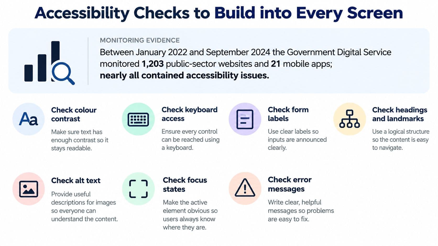
Between January 2022 and September 2024, the Government Digital Service monitored 1,203 public-sector websites and 21 mobile apps, with nearly all containing accessibility issues and 29,787 issues identified overall, according to its accessibility monitoring report. Visual approval alone isn't enough: many barriers involve structure and behaviour that a polished screenshot doesn't reveal.
For public-sector work, accessibility is a legal constraint: GOV.UK's accessibility requirements state that the website regulations came into force on 23 September 2018 and identify WCAG 2.2 Level AA as the relevant standard, alongside an accessibility statement. Public-sector mobile apps had a compliance deadline of 23 June 2021 under the government's monitoring guidance.
Specify what the screenshot can't demonstrate
- Text contrast: Check body text against a minimum ratio of 4.5:1 and large text against 3:1, including text over images and muted helper text.
- Keyboard focus: Show a visible indicator for every interactive component and annotate a logical focus sequence.
- Structure: Specify heading levels, reading order and relationships between instructions, fields and supporting content.
- Form labels: Give every field a persistent label; placeholder text alone isn't enough.
- Useful errors: Name the affected field, explain the correction and show where the message appears.
- Image meaning: Note alt-text intent beside meaningful images and mark decorative images accordingly.
- Zoom and reflow: Review content at 200% zoom without horizontal scrolling for ordinary page content, and document exceptions requiring implementation testing.
- Touch targets: Design targets at least 24 by 24 CSS pixels, with enough separation to avoid accidental activation.
- Motion: Provide reduced-motion alternatives instead of relying on animation to communicate progress or state.
Separate design evidence from implementation evidence
A contrast plugin can check selected colours. It can't establish whether a screen reader announces an error correctly or whether keyboard focus becomes trapped inside a modal.
A mockup can specify accessible behaviour; only testing the implementation can confirm that behaviour works.
Prioritise focus, names, contrast, semantic relationships, keyboard operation and resizing during review. Record which checks you've completed in the design file and which require browser or assistive-technology testing.
Our inclusive design principles provide a broader framework for involving people with different access needs. Test important states with people who use assistive technology rather than treating an automated pass as approval.
Campaign assets need attention too. If the page includes Pinterest graphics, Pin Generator's guide to creating pins can support asset preparation, but keep essential information in accessible page content rather than only inside promotional images.
Signing Off the Mockup Before Development Starts
Sign-off is a go-or-no-go decision about readiness, not a vote on whether stakeholders like the colour palette. Approve the evidence and the remaining risks together.
Test the journey before requesting approval
- Prioritise valuable journeys. Choose the UK audience's important tasks, such as discovery, enquiry, account creation or checkout.
- Use realistic conditions. Include actual content, errors and recovery, not just the successful route.
- Moderate representative task tests. Give participants a goal without revealing the intended clicks.
- Record observable results. Capture completion, errors, time-on-task and severity, distinguishing hesitation from a blocking failure.
- Revise and retest. Resolve the highest-severity problems before handing the design to engineering.
The Government Digital Service's 2020–2021 monitoring report identified 2,691 issues across 421 tests: visible focus accounted for 12%, accessible names, roles and values 11%, minimum contrast 11%, information-and-relationships markup 9%, keyboard operation 8% and text resizing 8%. Use those categories to challenge incomplete component specifications, not to claim that a prototype has passed an accessibility audit.
Make the approval actionable
Walk stakeholders through the goal, the user's decisions and the consequences of rejecting a proposed solution. A screen-by-screen slideshow encourages isolated aesthetic feedback; a task walkthrough keeps attention on whether the experience works.
Give developers a 30-minute walkthrough of the prototype and annotations before build. Keep a decision log containing the approved change, rationale, owner and any unresolved dependency.
Release gate: Proceed only when the main journey passes testing, accessibility checks are recorded and developers confirm the handoff is complete.
If the client continues after the prototype, our same team scales it into a full product, scoped once the idea is validated, then maintains it after launch. Keep that continuity useful by preserving decisions rather than asking engineers to reconstruct them.
For a web build, explore our web development service, review the Edinburgh Council project, or start a discovery conversation. The H2OiQ and Cultaholic project pages provide further context when considering different website requirements.
Frequently Asked Questions About Website Design Mockups
How many screens should a mockup include?
Include enough screens to represent the main journey and its important alternatives, rather than aiming for a fixed total. Cover the homepage, key landing page, every step in the primary task, and relevant error and empty states. Critical pages need desktop and mobile versions. Repeated page types can share a template, provided the annotations explain how different content lengths and component combinations behave without requiring a separately designed screen for every URL.
Can a mockup be reused if the developer changes?
Yes, provided the ownership agreement permits reuse and the handoff includes editable files, assets, tokens and the decision log. A new developer also needs access to the prototype and any licensed resources they're expected to use. Check whether fonts, photography or third-party components have transferable permissions. Remove obsolete explorations from the approved handoff, or label them clearly, so the replacement team doesn't accidentally implement a rejected direction.
What if stakeholders keep changing the design after sign-off?
Treat post-sign-off changes as explicit scope decisions rather than informal edits. Require a written reason, record each request in a change log and estimate its cost and delivery impact before approval. Separate corrections to an agreed requirement from new requirements or preferences. Give someone authority to accept the trade-off, including what gets delayed or removed. This keeps useful changes possible without allowing every new opinion to reopen the entire design.
Must a mockup match the final browser rendering?
No, a mockup communicates design intent rather than guaranteeing identical pixels in every browser. Developers need to test fonts, spacing, content wrapping and breakpoints in real conditions. Annotations should establish which relationships must remain consistent and which dimensions can flex. Review the implementation against those rules, not just a screenshot overlay. If a difference affects readability, hierarchy or task completion, resolve it; minor rendering differences don't automatically indicate faulty implementation.
About the Author
Hamish Kerry is the Marketing Manager at Arch, where he's spent the past six years shaping how digital products are positioned, launched, and understood. With over eight years in the tech industry, Hamish brings a deep understanding of accessible design and user-centred development, always with a focus on delivering real impact to end users. His interests span AI, app and web development, and the significant potential of emerging technologies. When he's not strategising the next big campaign, he's keeping a close eye on how tech can drive meaningful change.
Hamish's LinkedIn: Hamish Kerry
Arch offers discovery, UI/UX design and web development to turn an uncertain website idea into a tested plan and a production-ready build. Visit Arch to discuss the journey your mockup needs to prove and the evidence you'll need before committing to development.