Services / UI & UX Design
UI & UX Design.

Design Strategy & Planning.
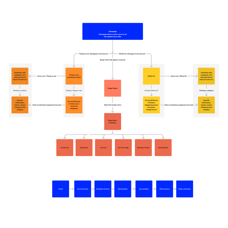
Building on Discovery, we start every UI/UX project by translating insights into structure. Using your Scope of Work as a foundation, we explore how different user groups will interact with your product. User flow diagrams are mapped out to show how users navigate toward key actions, helping us prioritise journeys and minimise friction before any design work begins.
This strategic planning ensures the product’s design meets both business and user needs, creating a streamlined experience from the first interaction to the final conversion.

Wireframing.
Wireframes are where structure comes to life. Created during the Discovery phase, these low-fidelity layouts map the bones of each screen or page. They define navigation, hierarchy, and content placement, helping both design and development teams align on how the product will function.
We move quickly at this stage to gather internal and external feedback, iterating on layout and user flow before applying visual design. This ensures we’re making decisions rooted in logic and user needs, setting a strong foundation for what comes next.

Visual Design & Components.
Once wireframes are approved, we start developing the visual language of your product. Using Figma, we introduce typography, colour palettes, iconography, and imagery that reflect your brand. We also design and apply reusable components; buttons, forms, menus, and more to ensure consistency and efficiency.
These mid-fidelity designs give you a strong sense of what the final product will look like, while still leaving space for feedback and iteration.

High-Fidelity Prototyping.
The final design phase brings everything together into a fully interactive prototype. This high-fidelity mockup reflects real content, true navigation, and live-like interactions giving stakeholders a realistic sense of the product in action.
At this stage, we focus on refining transitions, checking accessibility, and testing usability. You’ll receive a Figma prototype link that looks and feels like the real thing, giving your team and developers a clear direction forward.

Hand-off & Iteration.
Once your prototype is signed off, we prepare everything needed for development. That includes final UI files, documentation, and design specs, ensuring every interaction, layout, and component is ready for build. We also remain available for any design tweaks that support improved functionality during development.
Although changes may occur later, our thorough design process ensures the core experience is validated, accessible, and aligned with user expectations.
UI/UX DESIGN
Deliverables.
UI/UX DESIGN

