



Icon Usage Guidelines: A Practical Guide for Modern Teams.
Icon usage guidelines for designers and product teams. Covers naming, grids, accessibility, formats, platforms and governance.
Icon Usage Guidelines: A Practical Guide for Modern Teams.
- Decide before you draw. Most icon sets fail because teams add glyphs too early and do not ask whether an icon is needed.
- Labels beat cleverness. If the meaning isn't instantly recognisable, pair the icon with text or skip the icon entirely.
- Keep one naming system. Stable names, semantic categories and versioning matter more than visual polish in production.
- Treat sizing as engineering, not taste. Grid consistency, stroke weight and hit area rules keep icons crisp across web, iOS, Android and Flutter.
- Accessibility is essential. Icons need contrast, touch targets and screen reader support, or they become friction instead of clarity.
- Governance keeps the set alive. Testing, deprecation and audits stop icon libraries from turning into clutter.
Most advice on icon usage guidelines starts in the wrong place. It begins with drawing, polishing, or choosing a style, then wonders why teams still ship confusing interfaces. In production, the expensive mistake is a missing decision about what the icon is for, when it's allowed to exist, and who owns it once it ships.
An icon system is a shared language across design, engineering, content and accessibility. It has to communicate meaning quickly, survive localisation, render crisply at export size, and stay usable on small screens and in dense enterprise interfaces. The UK Government Statistical Service's ONS Service Manual makes that practical by saying icons should support content, not replace it, and should not be used in isolation because meaning can vary between people. It also gives concrete sizing guidance for public sector work, including 16×16 px small icons, 32×32 px medium icons and 64×64 px large icons, with matching print sizes for each tier, which shows icon usage is really a legibility problem as much as a visual one. ONS iconography guidance
Good icon sets do less. They avoid decorative noise, protect text labels, and stay consistent across platforms. That's the lens for everything that follows, because the strongest production systems are built by removing ambiguity.
Key Takeaways and Why Most Icon Sets Fail
The five decisions that make or break an icon system in production are naming clarity, grid consistency, accessibility, file format choice and governance. If any one of those is weak, the set starts to drift. The result is usually the same: icons look fine in a design file and fail in the product.
The real failure mode is ambiguity
Teams often treat icons as decoration, then expect users to infer meaning from shape alone. That's backwards. The University of the Arts London guidance says icons should be used consistently for visual coherence and quick recognition, and should not be used decoratively or without labels when the meaning is not obvious. The ONS guidance reaches the same conclusion from a public-sector angle, saying icons should add detail, increase impact, or support larger illustrations, not sit alone and force interpretation. UAL icons guidance
Practical rule: if the icon needs a long explanation in a design review, it probably shouldn't ship as icon-only content.
What an icon system has to do is simple to say and hard to execute. It must communicate meaning quickly, stay legible at different scales, remain recognisable after localisation, and pass accessibility checks without becoming noisy. What it does not need to do is carry branding on its own, act as a replacement for labels, or become a visual garnish for empty space.
Teams usually slip when they optimise for the library over the user. They add variants because the set looks incomplete. They keep icons because deleting them feels like losing work. The better question is what to remove so the interface scans faster and the product reads more clearly.
What production teams should measure
A useful icon review asks the same five questions each time:
- Can a new user understand it quickly? If not, the label has to do more work.
- Does the same shape mean the same thing everywhere? If not, the system is already inconsistent.
- Will it survive small sizes and touch targets? If not, it's a desktop ornament, not a product asset.
- Does it have a clear export path? If not, it will look different in every stack.
- Who owns updates and removal? If nobody does, the set will sprawl.
That last point is the hidden cost. Icon libraries rarely fail because they were poorly drawn. They fail because nobody defined the rules for stopping, renaming, or retiring them.
/uploa
For a broader look at how visual systems and product structure fit together, the internal guide on user interface design is a useful companion.
Deciding When an Icon Is the Right Choice
Strong icon systems do not begin with drawing. They begin with refusal. If a concept takes too long to map to a symbol, the symbol is probably the wrong tool. NN/g's icon usability guidance is direct on this point: if it takes more than 5 seconds to think of an appropriate icon, the concept is likely too abstract for an icon to communicate well. NN/g icon usability
Use recognisability as the first gate
Start with what users already recognise. Search, filter, close and hamburger menus usually earn a place because people already have a shared visual model for them. That is not true for concepts such as premium, contextual help or abstract settings, which often need labels, supporting copy, or a different UI pattern entirely.
If the meaning is not obvious without a caption, the icon is doing too much work.
NN/g also recommends testing memorability, not just first recognition. If users cannot remember what the icon means after time has passed, you have built a symbol that depends on repeated training. That is a poor trade for enterprise software, mobile apps, or public-sector interfaces where users need to complete tasks quickly.
When icon-only is acceptable
Icon-only can work in a few narrow cases.
- Search and filter: These are common enough to be read quickly in familiar contexts.
- Close or dismiss actions: In compact interfaces, the meaning is usually immediate.
- Status signals with strong visual conventions: Even then, the shape needs to be clear and consistent.
Every other case needs caution. If an icon triggers a destructive action, opens an uncommon control, or represents a concept that varies by culture or domain, text should be visible. The European Commission's component guidance is clear that icons should be used sparingly, must not replace labels or navigation items, and should be paired with text when recognition is not already proven by user testing. EU icon usage guidance
The same judgement should show up in product reviews. Ask whether the glyph reduces friction or just adds another layer to decode. In the kind of interface work discussed in practical user interface design guidance, teams often discover that the label they were trying to avoid is the clearest part of the control.
The failure mode is ambiguity
Icons fail most often when their meaning drifts from one team or surface to another. A symbol that feels obvious in a design file can become unclear once it sits beside real content, localisation, and platform conventions. That is why decision-making has to include context, not just the glyph itself.
A useful test is whether the icon survives without explanation in a multilingual interface. If the answer is no, do not force it into the design. Remove it, simplify the control, or keep the text and treat the icon as optional support.
For teams building a broader design language, what a design system is is worth reading before expanding an icon library.
.jpg&w=2048&q=75)
Naming Conventions and Semantic Categories
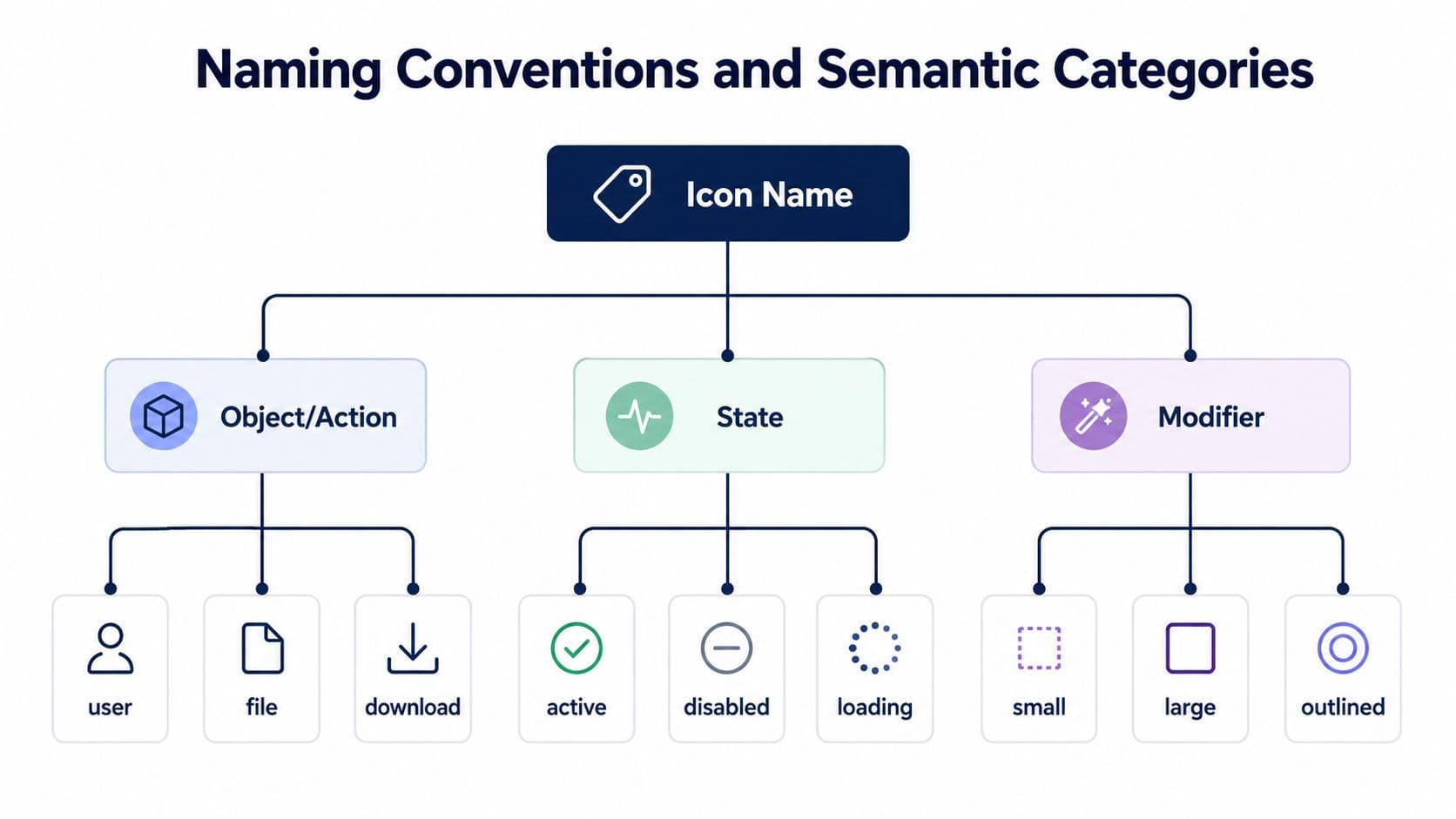
A good icon name is a contract between design, code and content. Good systems use names that describe the icon's semantic role, then keep that meaning stable across platforms. That stability matters because once a name leaks into code, changing it becomes expensive.
Build categories before you name files
Start with a taxonomy. Most product teams need at least four buckets: navigation, status, action and content. Public-sector interfaces often go a step further because users expect different cues for process steps, supporting information and system feedback. Mixing those categories is where mental models break. A shopping bag used as a generic wallet icon, for example, makes the interface feel arbitrary because the symbol no longer matches the user's expectation.
A strong pattern is to pair an object or action with a state or modifier. That gives you composable names like download-filled, download-outline, or user-disabled. The point isn't elegance for its own sake. It's to make the library predictable in code, searchable in documentation and consistent in design handoff.
Write one line for every glyph
Every icon in the registry should have a short definition: one line that states what the symbol means and where it should be used. That stops designers, developers and content writers from guessing.
A useful entry looks like this:
- Name: search
- Meaning: Opens search input or search view.
- Use case: Header actions, filters, compact toolbars.
- Do not use for: Generic discovery, browsing or suggestions.
That kind of definition is more helpful than a folder full of SVGs. It gives teams enough context to use the icon consistently and enough restraint to avoid inventing duplicates.
Practical rule: if two icons solve the same problem, one of them should probably be removed, not renamed.
Keep versioning visible
Icons change. Products grow. A naming scheme needs to survive that. A versioned registry lets teams retire old names, introduce new variants and keep Flutter, web and native codebases aligned. It also prevents the common problem where one team calls a symbol settings and another calls it preferences, even though both are trying to describe the same action.
Consistency in naming does more than tidy a library. It reduces search time, lowers implementation mistakes and gives content teams a language they can use in navigation, microcopy and help content without translating the meaning every time.
Grid, Stroke and Sizing Maths That Hold Up
A consistent grid matters because export size is not a cosmetic choice: it decides how much detail survives when an icon moves from a design file into a phone UI or a printed leaflet. The ONS guidance gives a rare level of specificity here, with 16×16 px artboards for small UI use, 32×32 px for supporting process steps and 64×64 px for larger print applications, each paired with print sizes that make the guidance usable across channels. ONS iconography guidance
Use the grid to protect proportion
A 24×24 artboard with a consistent live area is one of the cleanest ways to keep a set stable across web, iOS and Android exports. The grid gives stroke weight, corner radius and internal spacing a fixed relationship. If those values are chosen independently, icons start to look unrelated even when they share the same style.
Round shapes need different optical handling from square ones. A circle can sit slightly larger in the live area and still feel balanced, while squared forms often need more internal breathing room to avoid looking heavy. The answer is tighter discipline.
Keep stroke and scale tied together
Stroke weight and corner radius should be paired, not picked separately. A thin stroke on a rounded glyph can disappear at small sizes, while an overly heavy stroke turns a simple shape into a blob. That matters most in small UI slots, where a clear silhouette matters more than literal detail.
A practical export pipeline usually works like this:
- Design master: one canonical grid.
- Scaled exports: render at the platform size you need, not a random hand-tuned variant.
- Padding control: preserve empty space so touch targets do not collapse around the symbol.
- Print checks: verify the icon still reads in the millimetre sizes used by the channel.
Teams often spend too long tweaking individual exports instead of stabilising the base grid. The better approach is to get one master right, then let the sizing rules do the work.
Match the target, not the trend
Web, iOS and Android each expose icons differently, but the math stays the same. A symbol should remain legible when it is reduced, and the export process should not force a redesign. That is why the public-sector size tiers matter. They connect interface scale to real-world legibility, which is exactly what many style guides miss.
If an icon only works at one size, it is not a system. It is a one-off.
Platform-Specific Rules for Web, iOS, Android and Flutter
Cross-platform icon work fails when teams assume one asset can be dropped into every stack without adjustment. The shape may stay the same, but the platform context changes. Web, iOS, Android and Flutter each have different conventions around rendering, accessibility and interaction.
Web needs flexibility and clarity
On the web, SVG is usually the cleanest choice because it scales without losing crispness and works well with CSS sizing. Icon fonts still appear in legacy systems, but they're harder to govern, less flexible for individual styling, and awkward for accessibility when compared with descriptive markup and proper labels. In component libraries, the winning pattern is usually a named icon component that accepts size, colour and accessibility props, then renders an SVG with consistent defaults.
iOS and Android care about native vocabulary
On iOS, icons need to sit comfortably beside SF Symbols or match the same weight logic if you're using a custom set. Template images, scale modifiers and monochrome treatment all matter, because the platform rewards consistency. Android has its own expectations, especially around vector drawables and adaptive icon foreground and background treatment. Filled and outlined forms also need to be used with care, because they often imply different states as well as different aesthetics.
Practical rule: if a platform already has a strong native icon language, custom icons should match it closely or stay out of the way.
Flutter sits between them
Flutter gives teams a lot of freedom, which is useful and dangerous at the same time. Icon and IconData work well for built-in or font-based assets, but custom sets still need clear naming, size defaults and accessibility support. If you bring in a third-party icon pack, you still need the same governance you'd use anywhere else, because a package doesn't solve semantics.
The core convergence point across all four platforms is simple: a 24×24 grid, a single weight per style and a monochrome default unless colour carries meaning. The divergence is in the implementation details: Apple's weight vocabulary, Android's adaptive icon safe zones and Flutter's asset handling each add their own edge cases.
If you're shipping one icon set into multiple products, don't ask only whether the artwork is nice. Ask whether the same icon can be rendered, labelled and touched correctly on every stack without a platform-specific workaround.
Accessibility, Contrast and Touch Targets
Accessibility should be built into icon usage guidelines from the first draft, not patched in later. The IBM UI icon guidance says monochromatic icons need the same 4.5:1 contrast ratio against the background that typography does, and it sets 44px or greater for touch surfaces. Michelin's design system uses 48px by 48px for icon click targets and warns that details get lost if stroke weights and hit areas are too small. IBM icon guidance, Michelin icon usage
Contrast and colour can't do the whole job
Colour alone should not be the only signal. If a status icon changes only hue, colour-blind users can miss the state change and screen-reader users get nothing from it. The safe pattern is to pair colour with shape, label or both. That keeps the meaning intact when the palette shifts, contrast changes or the UI sits on a busy background.
Touch targets need padding, not stretched glyphs
A small glyph inside a larger hit area is better than a bigger, blurry icon. Rescaling the artwork just to make it tappable usually damages legibility. Padding gives the user a comfortable target without changing the visual rhythm of the icon set.
The same logic applies to mobile and desktop. A control can be visually compact and still be easy to use if the interactive area is generous. That's especially important in dense apps where multiple icons sit close together and every missed tap becomes a support issue.
Screen readers need explicit meaning
Web icons should use appropriate labelling, usually via aria text or adjacent visible text. In Flutter, that means accessibilityLabel and accessibilityHint where the icon conveys meaning. On iOS and Android, the equivalent semantics need to be wired into the component so the icon doesn't disappear into the accessibility tree as an unlabeled shape. Decorative icons, on the other hand, should be hidden from assistive tech entirely when they add no information.
The University of Tennessee Torch Theme guidance is useful here because it treats icons as directly connected to content, scaled proportionally and kept at the same relative size, which reinforces the idea that icons should support meaning instead of floating as ornament. UTK icon guidance
For more depth on inclusive product work, designing for all pairs naturally with the rules above.
File Formats, Performance and Component APIs
Asset choice affects bundle size, delivery speed and developer friction. In most modern app stacks, SVG is the default winner because it scales cleanly and stays editable in code pipelines. PNG still has a place in legacy email templates or asset pipelines that can't handle vector rendering well, but that is now the exception.
Pick formats that survive implementation
What matters is whether a file behaves predictably inside the app, whatever it looks like in design software. SVG works well when the icon needs to respond to theme, size or colour changes. Font-based solutions can still be useful for tightly controlled libraries, but they add a governance burden because naming, fallback and rendering all become coupled.
A practical component API should accept the same core inputs everywhere:
- Name: maps to a known registry entry.
- Size: matches platform tokens, not arbitrary pixel values.
- Colour: defaults to the product system, unless the icon carries meaning.
- Accessibility props: ensure labels and hints can be attached without hacks.
That API consistency matters because it keeps the icon system alive after launch. If every team has to remember separate rules for every screen, the library becomes hard to trust.
Performance is a design decision
A bloated icon pack slows down review, implementation and maintenance long before anyone measures page weight. The cleaner pattern is to keep the registry small, reuse symbols that already exist and set a tight per-icon budget inside the asset pipeline. That budget is less about a specific file size than about preventing careless over-detail, multiple duplicate variants and unnecessary exports.
Practical rule: if the component API is awkward, teams will bypass it, and the icon system will fragment within one release cycle.
The final test is deliberately boring. Can a developer add the icon in one line, can a designer name it unambiguously, and can a screen reader user understand it? If all three are true, the system is strong enough to ship.
Testing, Maintenance, FAQ and Final Checklist
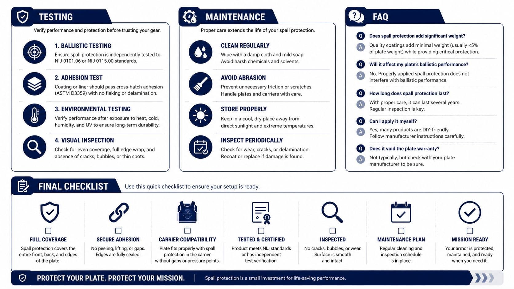
Icon governance only works if it's treated like an ongoing product practice. Unit tests should assert that the registry contains known names, visual regression tests should catch stroke drift, and user testing should check whether new icons are recognisable before they ship. The State of Michigan guidance is especially useful here because it says icons should be used consistently, shouldn't depend on colour alone, and should only be clickable when they're inside a button. Michigan iconography guidance
A simple maintenance rhythm
A deprecation workflow should give engineers time to migrate before old names are removed. That keeps releases calmer and avoids breaking changes in shared component libraries. It also gives content teams time to update labels and help text if a symbol changes meaning or disappears.
FAQ
How do I audit an existing icon set?
Start with the registry, not the artwork. List every icon name, check whether each one still has a clear label, and remove any symbol that exists only because it was once convenient. Then test recognisability with a small group of users and compare the results against the rule that labels should stay visible when meaning isn't immediately obvious.
When should a team build icons versus buy them?
Buy when the product needs common actions and your brand doesn't depend on a highly distinctive icon language. Build when the system has domain-specific terms, public-sector needs, or a strong cross-platform component model that must stay consistent. In both cases, ownership matters more than origin.
How do you handle cultural ambiguity in international products?
Use the icon only if the symbol survives across regions and user tests. If it doesn't, keep the text label visible and let the icon act as a secondary cue at most. That's the safest route for enterprise, government and multilingual interfaces where misreading an icon can block a task.
Final checklist
- Naming: every icon has one semantic meaning.
- Grid: stroke and spacing follow one shared system.
- Accessibility: contrast, labels and touch targets are wired in.
- Formats: the asset matches the platform and use case.
- Governance: registry, testing and deprecation are documented.
Arch helps teams turn icon usage guidelines into a working system, not just a Figma file. If you're shaping a mobile app, web platform or design system and need the underlying rules to hold up in production, visit Arch to see how we approach accessible, production-ready product design and engineering.