



User Interface Design: A Guide to Building Better Products.
A definitive guide to user interface design. Learn core principles, processes, and how to drive real business results in the UK market.
User Interface Design: A Guide to Building Better Products.
- UI design affects revenue, not just aesthetics. Every dollar invested in UI can return between $2 and $100 in revenue, and 94% of first impressions are tied to web design.
- Trust is visual first. In the UK, 78% of consumers say visual design is the main factor in whether they trust a brand, and 62% would leave if a site feels unprofessional.
- Small interaction details matter. UK mobile apps with predictable button behaviour saw a 22% increase in task completion rates.
- Accessibility is commercial and operational. Poor detectability in trend-led smart device interfaces led to a 45% increase in user errors, while high contrast and texture-based affordances improved error correction by 37% among UK users with visual impairments.
- A good UI process reduces risk before development starts. Clear flows, wireframes, prototypes and handoff specs stop expensive rework later.
- You can measure UI performance without enterprise tooling. Task success, time on task, error rate, conversion and support themes give a reliable picture.
- Good interface work balances brand, usability and compliance. If one of those wins at the expense of the others, the product tends to suffer.
Icons are a small but frequent test of that balance, and we've set out rules for using icons consistently across a product.
Introduction The Business Case for User Interface Design
A lot of teams still treat user interface design as the finishing layer. That's backwards. The interface is where users decide whether your product feels credible, usable and worth their time.
The business case is unusually direct. Every dollar companies invest in UI yields a return of between $2 and $100 in revenue, and 94% of first impressions of a brand are directly related to web design (verified research reference). That range is wide, but the conclusion is simple. Interface quality isn't decoration. It's commercial infrastructure.
For a CTO, that means fewer stalled journeys and less friction between product intent and real user behaviour. For a marketing lead, it means trust forms before a user reads the copy. For an operations team, it means fewer avoidable errors and less support load caused by unclear screens.
Practical rule: If a screen looks polished but users still hesitate, the UI isn't finished. Good user interface design has to clarify action, not just express brand.
The strongest UI work sits at the intersection of four things:
- Business goals: Revenue, retention, activation, lead generation or service efficiency.
- User expectations: Clear paths, recognisable controls and fast feedback.
- Technical reality: What can be built cleanly, maintained sensibly and scaled.
- Compliance: Accessibility, detectability and sector-specific obligations.
That's why serious teams don't ask whether UI matters. They ask where it has the highest impact.
What Is User Interface Design And What It Is Not
User interface design is the design of the parts people interact with. Screens, buttons, form fields, menus, states, labels, spacing, typography, colour, feedback, transitions and component behaviour all sit inside it.
It isn't the whole product experience. That's where teams often blur UI and UX together and lose precision.
A simple way to separate UI and UX
A useful analogy is a house.
UX design is the architecture. It decides where the doors go, how you move between rooms, whether the kitchen belongs near the dining space, and whether the layout matches how people live.
UI design is what makes that house legible and usable once the structure exists. It covers the handles, switches, lighting, finishes, signage, surfaces and visual cues that tell you what to do without needing explanation.
If the architecture is wrong, the house is awkward.
If the interface layer is wrong, the house is frustrating.
You need both.
What UI design includes in practice
In real delivery work, user interface design usually covers:
- Visual language: Typography, colour, spacing, iconography, elevation and layout rhythm.
- Interactive controls: Buttons, toggles, dropdowns, search, tabs, inputs, filters and navigation.
- System feedback: Loading states, confirmations, errors, disabled states and inline guidance.
- Behaviour rules: How components respond on tap, click, focus, hover and validation.
- Design consistency: Reusable patterns so users don't have to relearn the product on every screen.
A common mistake is to reduce UI to branding. Brand matters, but interface design has to carry meaning. A button style isn't successful because it looks premium. It's successful if people immediately recognise it as actionable, trust it enough to use it, and get the expected result.
A strong interface removes doubt before a user notices they've made a decision.
What UI design is not
UI design means more than making things "look modern". Gradients, glass effects or animation for their own sake do not count, and neither does choosing a nice font at the end of the sprint.
It also depends on product and engineering. A designer who ignores implementation creates brittle work. A developer who treats UI as surface polish tends to ship inconsistency. The strongest results come when product, design and engineering agree on the rules that govern the interface.
That matters even more in products with multiple user types, legacy constraints or public-facing services. In those environments, clean user interface design acts like a translation layer between business complexity and user clarity.
The Core Principles of High-Converting UI
The interfaces that convert well rarely rely on novelty. They win because they make the next step obvious, reduce uncertainty and keep users moving.
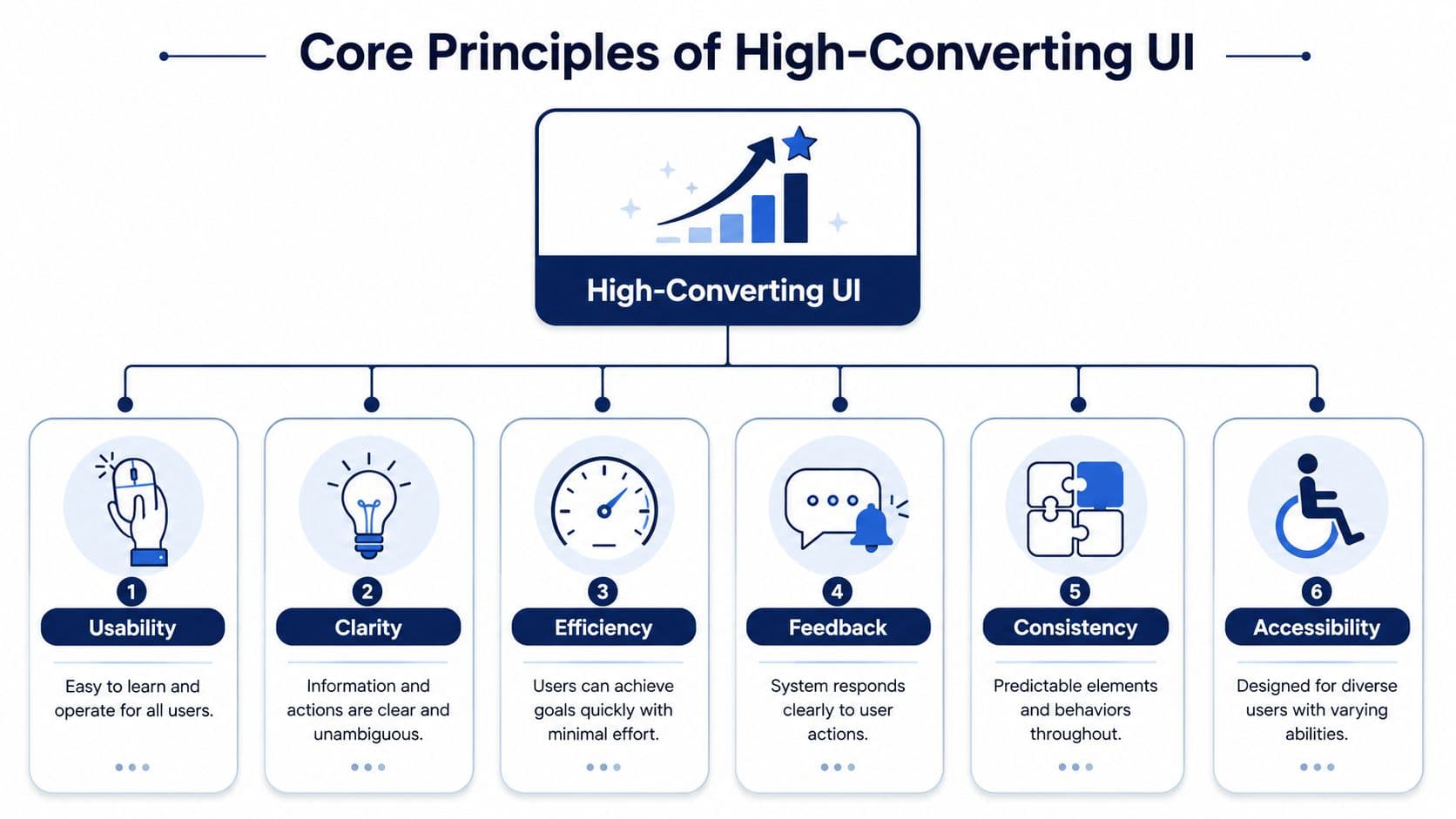
Clarity beats cleverness
Users don't arrive ready to admire your interface. They arrive with a task. They want to book, compare, apply, pay, check, upload or move on.
Clarity comes from obvious hierarchy, plain labels and visible priorities. Primary actions should look primary. Secondary actions shouldn't compete with them. Supporting information should support, not dominate.
When teams chase originality too early, they often hide intent. That usually shows up as vague button text, indistinct cards, low-contrast controls or layouts where everything looks equally important.
Consistency lowers cognitive load
Consistency is one of the least glamorous parts of user interface design, but it's one of the most impactful. If buttons behave differently across similar screens, users slow down. If spacing shifts unpredictably, the product feels less trustworthy. If one form validates inline and another waits until submit, users assume mistakes are their fault.
Reusable patterns matter more than one-off screen design.
According to the 2023 UK Nielsen Norman Group UX Benchmark, UK-based mobile apps that implemented predictable button behaviour saw a 22% increase in user task completion rates (UK mobile app benchmark summary). That lines up with what product teams see every day. Predictability reduces hesitation.
Feedback keeps momentum intact
Every user action creates a question. Did that work? Is it loading? Has the payment gone through? Did the system save my change?
Good interfaces answer those questions immediately. They use loading states, progress indicators, confirmations and specific error messages. Weak interfaces stay silent, and silence forces users to guess.
Three feedback rules usually hold up well:
- Show system status quickly: Users shouldn't wonder whether a tap registered.
- Make errors specific: "Something went wrong" rarely helps anyone recover.
- Confirm important actions clearly: Especially in payments, account changes or irreversible steps.
Accessibility improves conversion quality
Accessibility isn't separate from conversion. It improves readability, recognisability and ease of action for everyone. The same work that helps a user with low vision often also helps a distracted commuter, a tired shift worker or someone using a poor screen in bright light.
For teams building apps, platforms or responsive services, designing for accessibility should sit inside the core UI system, not in a compliance pass near launch. The same applies if you're planning or improving mobile app development services, where component behaviour gets repeated hundreds of times across a product.
The fastest way to damage conversion is to make users stop and interpret the interface.
Efficiency is the cumulative result
Users feel efficiency when the other principles are working together. The form is short enough. The next action is clear. The keyboard matches the field type. The button responds instantly. The error appears near the issue. The confirmation closes the loop.
No single flourish creates that feeling. Systematic UI design does.
A Practical UI Design Process and Key Deliverables
Most clients don't need a theatrical design process. They need a process that reduces risk, creates alignment and leaves engineering with something buildable.
A sound UI process usually moves from uncertainty to specificity. Not in a straight line every time, but in a way that steadily removes ambiguity.
.jpg&w=2048&q=75)
Discovery starts with decisions
At the start, the biggest risk isn't visual quality. It's solving the wrong problem elegantly.
Discovery work typically looks at the current product, user needs, business goals, technical constraints and known friction points. On a web platform, that might mean reviewing signup flow, navigation depth, form friction and content hierarchy. On an internal tool, it might mean understanding operational edge cases that would never show up in a marketing brief.
This stage produces shared definitions. Who are the main users? What task matters most? What has to ship first? What does success look like in behaviour terms, not just brand terms?
If that foundation is weak, later design reviews become subjective very quickly.
Flows and wireframes expose logic early
Once the team knows the problem, user flows map the path. They show how a person gets from entry point to goal, where branches happen, and where the system has to respond to errors or permissions.
Wireframes then strip away visual polish so the team can focus on structure. That matters because many expensive mistakes are structural, not stylistic. Misplaced hierarchy, confusing screen order and missing states are far cheaper to fix at low fidelity.
Two deliverables tend to do most of the heavy lifting here:
- User flows: They clarify sequence, dependencies and edge cases.
- Wireframes: They test layout and information structure before visual design begins.
When teams skip this and move straight into polished screens, stakeholders often approve aesthetics while missing functional problems.
Prototypes make interaction testable
Static screens don't tell you enough. Real products live in movement, state changes and transitions between actions.
Interactive prototypes let teams test whether users can move through the interface with confidence. They also help engineers spot complexity before implementation. As a result, details such as modals, dropdown behaviour, validation logic and multi-step journeys become easier to challenge.
In UK digital products, structure and clarity have measurable effects. UI designs that adhere to ISO 9241-110 communication principles reduce task completion time, and strong visual hierarchy improves conversion in mobile contexts. The exact figures are well established in benchmark data, but the design takeaway is more useful than the number alone. Clear structure and detectable communication save time and improve outcomes.
Working principle: Prototype the risky parts first. Navigation changes, onboarding, payment, account setup and permissions usually reveal more than cosmetic screens.
For teams preparing a larger platform or service rollout, that process often sits alongside web development delivery, where design and engineering need to stay tightly aligned.
Visual design and handoff create production readiness
Once the structure works, visual design adds the system that users experience. Typography scales, spacing tokens, colour roles, icon rules, component states and motion guidance all need definition. At this point, a product stops being a collection of screens and starts becoming an interface.
Developer handoff should include more than pretty mock-ups. At minimum, a mature handoff usually contains:
- Component specifications: States, spacing, responsive rules and usage notes.
- Interaction notes: Hover, focus, loading, success and error behaviour.
- Asset guidance: Icons, imagery, copy constraints and naming conventions.
- Design QA criteria: What must be checked before release.
That handoff is where many teams discover whether their user interface design process was operational or merely presentational.
Essential UI Patterns and Modern Tools
Most good interface work relies on pattern recognition. Not because design should be repetitive, but because users benefit when common tasks look and behave in familiar ways.
Patterns solve repeat problems
Navigation bars, accordions, filters, pagination, tab systems, confirmation banners and empty states all exist for a reason. They solve recurring interface problems in ways users already understand.
The trick isn't to use patterns blindly. It's to choose them deliberately.
A few examples show the trade-offs:
- Tabs work well when content belongs in parallel categories and users may switch between views.
- Accordions help when secondary detail should stay available without dominating the page.
- Inline validation suits forms where immediate correction helps progress.
- Modal dialogs are useful for focused confirmation, but become harmful when stacked or overused.
Teams get into trouble when they invent a new interaction where an established one would do the job better. Novel navigation is rarely worth the learning cost.
Design systems turn good decisions into repeatable ones
Once a product grows, pattern quality depends on system quality. That's where tools like Figma, component libraries and design tokens earn their place as practical choices.
A design system gives rules to the recurring parts of the interface. It defines which button variants exist, how forms behave, what spacing increments are allowed, how cards nest, and when alerts, badges or modals should appear. That removes hundreds of low-value debates.
If you're weighing how this scales in practice, a useful next step is understanding what a design system is. It usually becomes essential as soon as multiple squads, feature areas or platforms share the same interface language.
Tools matter, but discipline matters more
Figma is the default design workspace for many teams because it supports shared libraries, prototyping and collaboration well. The tool is useful, but consistency still needs naming conventions, governance and a willingness to reuse components instead of redrawing them.
Hardware can affect speed too, especially in sketching and annotation. For designers or product teams who review flows visually, a precise Stylus Pen can make lo-fi ideation and markup far quicker than relying on trackpad-only feedback.
A healthy modern stack often includes:
- Figma for interface design and prototyping
- Shared component libraries for implementation alignment
- Design tokens for spacing, colour and typography rules
- Documentation for usage, edge cases and accessibility guidance
The value isn't in the stack itself. It's in creating fewer exceptions, stronger continuity and faster delivery.
Measuring the Success of Your User Interface
If UI quality can't be observed in behaviour, the conversation drifts into opinion. The goal isn't to measure everything. It's to choose a handful of indicators that reveal whether the interface helps users complete meaningful tasks.
Start with task outcomes
The strongest UI metrics are usually tied to user intent.
If a user needs to create an account, upload a document, request a quote or complete checkout, you can measure whether that happened and how smoothly it happened. That gives product and marketing teams something concrete to work with.
Useful measures include:
- Conversion rate: Did users complete the intended action?
- Task success rate: Could users finish the journey without assistance?
- Time on task: Did the interface help people move efficiently?
- Error rate: Where did users make avoidable mistakes?
- Support themes: What confusion shows up in chat, tickets or calls?
A good UI often improves several of these at once. A weak one usually shows failure in clusters. Slow journeys, higher error volume and support queries often point to the same design problem.
You don't need enterprise analytics to learn something useful
A lot of smaller teams assume meaningful measurement requires heavy A/B testing infrastructure. It doesn't.
For an SME or scale-up, useful signals can come from lightweight methods:
- Moderated usability sessions: Watch a small number of target users complete core tasks.
- Prototype testing: Check flows before engineering starts.
- Session replay tools: Review hesitation, repeated taps and abandoned form fields.
- Funnel analysis: Compare where users progress and where they stop.
- Support review: Collect recurring UI complaints and classify them by screen or task.
For example, if users consistently pause before choosing between two actions, the issue may be hierarchy, not demand. If users trigger validation repeatedly in one field, the issue may be label clarity, not user carelessness.
Use benchmarks carefully
Measurement works best when tied to a baseline. Compare the current flow against the revised one. Compare first-time users against returning users. Compare mobile behaviour against desktop where relevant.
One practical benchmark from UK public service design is worth keeping in mind. A 2024 Cabinet Office report found that 89% of UK citizens rated ease of use as the most critical factor in digital services, and 76% linked that ease of use to clear visual hierarchy and intuitive button placement (Cabinet Office findings via IxDF summary). That's public sector context, but the lesson applies more broadly. Users notice structure before they articulate it.
The most useful UI metrics are the ones that show users moving with less friction, and vanity metrics add little.
What matters most is consistency. Measure the same tasks over time, and the product starts telling you where interface work is paying off.
Common UI Design Pitfalls and How to Avoid Them
Most failed interfaces don't collapse because the team lacked effort. They fail because the wrong trade-offs won. Trendiness beat usability. Speed beat clarity. Brand expression beat detectability.
Chasing visual trends past the point of usefulness
Neumorphism and glassmorphism can look polished in presentations. In live products, they often weaken contrast, hide affordance and blur system states if applied carelessly.
In UK market deployments, smart device UIs that used neumorphic or glassmorphic trends without maintaining ISO 9241-13 detectability standards resulted in a 45% increase in user errors. In the same benchmark set, UIs with high contrast and texture-based affordances improved error correction rates by 37% among UK users with visual impairments. Those figures come from verified UK accessibility and safety data, and they reflect a practical truth. If users can't detect what's interactive, they make more mistakes.
The fix isn't banning modern styles. It's forcing every stylistic decision to pass a usability check. Can users identify controls immediately? Can they distinguish states? Can they recover from errors without guessing?
Letting inconsistency spread screen by screen
Inconsistency rarely arrives as a deliberate strategy. It appears when each feature team solves local problems in isolation.
One page uses filled primary buttons. Another uses outlined buttons for the same action. One form puts labels above fields. Another puts them inside placeholders. Navigation shifts position between sections. None of these choices seems fatal on its own. Together, they erode trust.
Three habits prevent that drift:
- Maintain a live component library: Reuse before creating new variants.
- Document behaviour rules: Loading, disabled, success and error states need standard treatment.
- Run design QA before release: Check built screens against the system, not just the mock-up.
Treating accessibility as a final review item
Accessibility shouldn't be handled as a compliance clean-up at the end. By then, most structural decisions are already expensive to change.
The commercial risk is obvious enough, but there can also be legal consequences. The EHRC 2024 Digital Accessibility Audit found that 61% of UK websites with inadequate colour contrast failed to meet the legal standard under the Public Sector Bodies Accessibility Regulations, and 43% of those sites experienced a 28% drop in conversions among UK users with visual impairments (EHRC audit summary via Coursera article). Even if you're not building for the public sector, the design lesson is hard to ignore.
A good public-facing benchmark for compliant delivery can be seen in projects such as Edinburgh Council's digital work, where accessibility and usability need to work together under real service constraints.
If users have to decipher the interface, the product is doing too much talking and too little guiding.
Designing for ideal paths only
Many interfaces work fine in a happy path demo and fall apart in ordinary use. Error states are vague. Empty states are blank. Permissions, failed payments, partial uploads and interrupted sessions get little attention.
The easiest way to avoid this is brutally simple. Design the broken, empty and edge-state screens with the same care as the polished main flow. That's usually where credibility is won or lost.
When to Partner with a Professional Design Studio
There comes a point where fixing the interface internally starts costing more than getting expert help. That point usually arrives before teams admit it.
The signs are usually operational
You might need a studio when the product is high stakes and moving fast. A new launch, a platform rebuild, an investor-facing MVP, a regulated service or a multi-brand rollout all increase the cost of poor interface decisions.
You also likely need support when your team has strong product and engineering capability but no senior interface leadership. Mid-level design can keep a system moving. It often struggles to reset one that has drifted.
Another common trigger is fragmentation. Different journeys have been built at different times by different teams, and now the product feels stitched together. Users may not describe that problem cleanly, but they feel it.
Trust loss is often the clearest signal
In the UK, 78% of consumers say a website's visual design is the primary factor in whether they trust a brand, and 62% say they'd abandon a site immediately if the design felt unprofessional (UK trust and visual design study). That's why interface quality tends to show up in brand perception long before someone writes "the UI is weak" in a report.
If customers hesitate, prospects drop out, internal stakeholders keep arguing over the same screens, or accessibility concerns emerge late in delivery, expert UI support usually pays for itself through reduced rework alone.
For teams at that point, specialist UI UX design support can help unify product thinking, visual language and implementation detail. If you also need an example of a digital brand experience where presentation and product clarity matter together, Cultaholic is worth reviewing. And if the issue is already affecting launch plans, it's sensible to contact the team directly.
Frequently Asked Questions About User Interface Design
What is the difference between UI and UX design?
UI design focuses on the visible and interactive parts of a product, such as buttons, forms, navigation, colour, spacing and component behaviour. UX design is broader. It covers the full journey, including structure, flows, information architecture and task logic. In practice, the two should work together closely. A product can look polished and still be frustrating if the UX is weak, and a well-planned journey can still fail if the UI is confusing.
How long does a UI design project usually take?
It depends on product scope, stakeholder complexity and how much has already been defined. A focused MVP with a clear feature set can move quickly, while a multi-journey platform with legacy constraints takes longer because more decisions need validating. The biggest variable is usually alignment, not software. Teams move faster when business goals, user priorities and technical constraints are agreed early, and slower when design is expected to solve unresolved product debates.
Does good user interface design always mean a minimalist interface?
No. Minimalism can help, but only when it supports clarity. Some products need dense interfaces because users rely on comparison, detail or frequent actions. Finance tools, operations platforms and data-heavy dashboards often need more visible controls than consumer apps. The question isn't whether the screen is sparse. It's whether the right information appears in the right order, and whether users can act confidently without hunting for essential controls or context.
Can SMEs measure UI performance without expensive tooling?
Yes. You don't need a full experimentation platform to learn what works. SMEs can review task completion in prototype tests, watch moderated sessions, analyse where users abandon forms, and use session replay or support feedback to identify hesitation and confusion. Lightweight measurement is often enough to reveal the main problems. What's more important is choosing a few business-relevant journeys and reviewing them consistently, rather than collecting a large volume of disconnected interface data.
How important is accessibility in commercial products?
It's central. Accessibility improves readability, interaction clarity and recovery from errors for a far wider group than the label sometimes suggests. It also reduces risk in sectors with stricter compliance expectations. Accessibility work often improves the core interface for everyone. Better contrast, clearer hierarchy, recognisable controls and stronger feedback don't just help a subset of users. They make the product easier to trust and easier to use under normal conditions.
About the Author
“Hamish Kerry is the Marketing Manager at Arch, where he has spent the past six years shaping how digital products are positioned, launched, and understood. With over eight years in the tech industry, he has a deep understanding of accessible design and user-centred development, with a focus on delivering real impact to end users. His interests include AI, app and web development, and the transformative potential of emerging technologies. Outside campaigns, he follows how tech can drive meaningful change.”
Hamish's LinkedIn: Hamish Kerry on LinkedIn
If you're reviewing a product, planning a rebuild or trying to raise trust and conversion through stronger user interface design, Arch can help you turn that brief into a production-ready digital product.