



Premium Website Design: What Makes a Site Feel High-End.
Learn what makes a website premium in 2026: UX, performance, accessibility and process, with UK evidence on premium website design.

Premium Website Design: What Makes a Site Feel High-End.
The most popular advice about premium website design is also the most misleading. Add more animation, bigger imagery and a bolder typeface and your site will feel high-end, so the argument goes. I'd argue the opposite. A site looks premium in a screenshot and fails in use every day, because the phone stutters, the keyboard focus disappears, or the checkout moves just as someone taps it. Premium is what still works under pressure.
Key Takeaways
- The phone decides premium: A site earns trust when people can use it quickly and clearly on the device in their hand, not when it carries the most animation.
- Field data beats a score: Real visitors on real phones reveal speed and stability that a single desktop test hides.
- The focus state is craft: Visible focus, correct labels and tested colour contrast belong in the design system from day one.
- A performance budget protects quality: Clear limits on images, scripts and content stop a high-end design decaying after launch.
- The prototype saves money: A clickable prototype lets you change direction while changes are still cheap.
Those five points only hold if you make one decision first, confirming the brief before design begins.
What Makes a Website Premium Beyond Visual Polish
Visual polish is the cheapest part of a premium website to fake. The parts that cost real money are the ones a visitor feels before they notice the typeface: whether the page explains itself, whether the structure holds under real content, whether every tap produces a response, and whether the same component behaves the same way on the tenth page as it did on the first. I define premium website design as a site that is clear about the business, quick on the phones customers use, usable by everyone, honest in its content, and easy to finish a task in.
Website ownership is now close to universal. The UK Government's Business Data Survey 2026 found 99% of large businesses and 93% of small businesses had a website. When almost everyone has one, existence stops being the differentiator. The experience is.
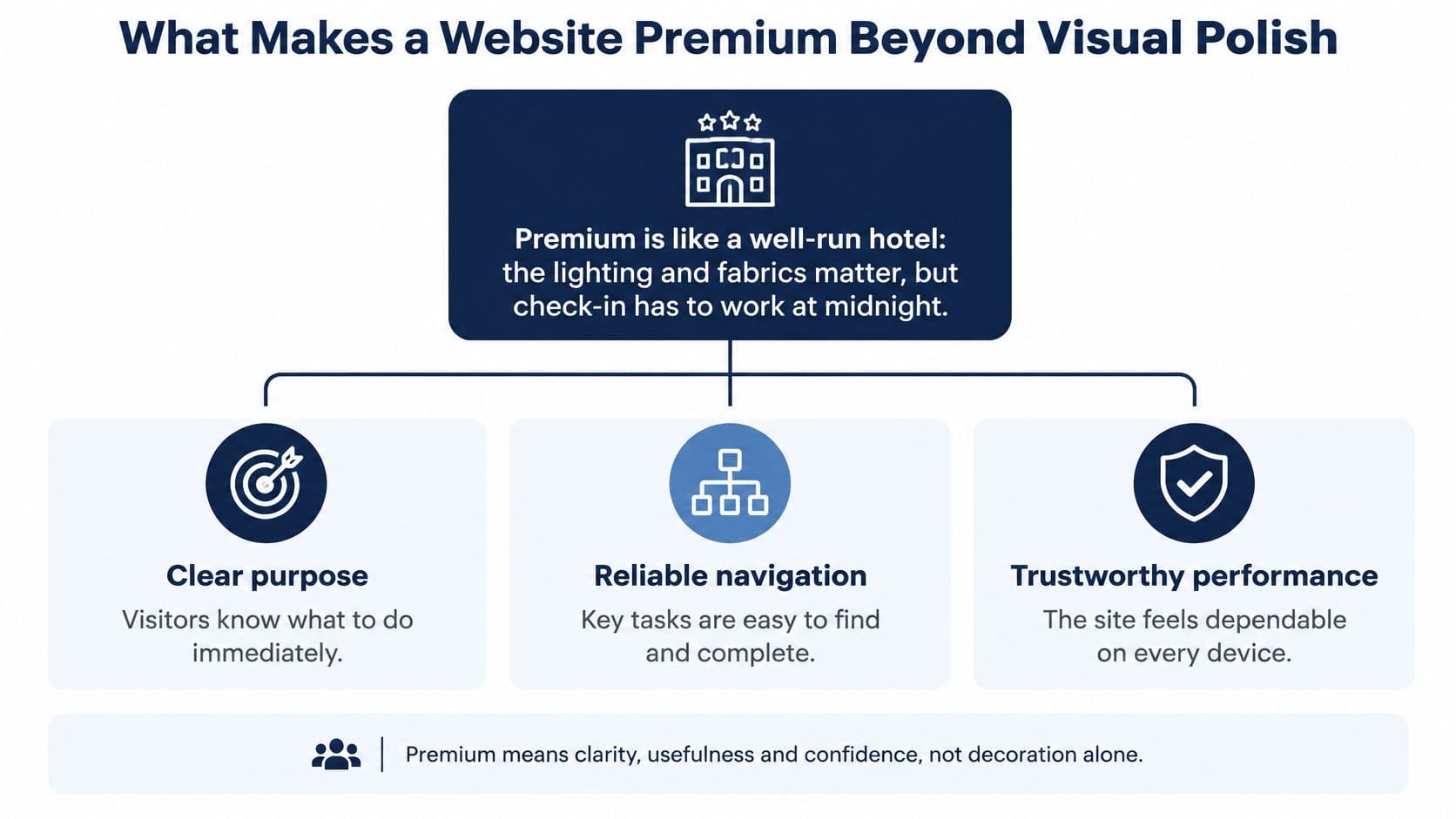
Five markers you can test today
- Five-second clarity: A stranger can state what the business offers, who it serves and what to do next within five seconds.
- Deliberate hierarchy: Type scale, spacing and alignment follow one system, so the eye knows what comes first, second and third without guessing.
- Content that answers ahead: Each page handles the next question, price signals, proof, delivery and risk, before the visitor has to hunt.
- Immediate response: Buttons, menus and filters react the moment they are tapped, with no dead pause.
- Consistent components: The same button, card and form behave identically on every template, so nothing feels assembled from spare parts.
Test those markers with real copy, real images and a slow phone, not a mood board. Decorative effects earn their place only when they support one of them. A scroll animation that delays the headline fails. A subtle transition that shows a form error in context passes. If an effect does not improve clarity, comprehension or confidence, it is decoration charging rent.
Run the five-second test on your homepage with someone outside the business and watch where they hesitate. That hesitation usually points to a hierarchy problem, a missing proof point or a vague next step. The same service-page mechanics transfer across sectors: conversion-focused roofing web design shows how a single trade page can move a visitor toward enquiry, and Arch's Cultaholic case study shows how hierarchy, content and consistent components carry a very different audience.
The Performance Users Actually Feel
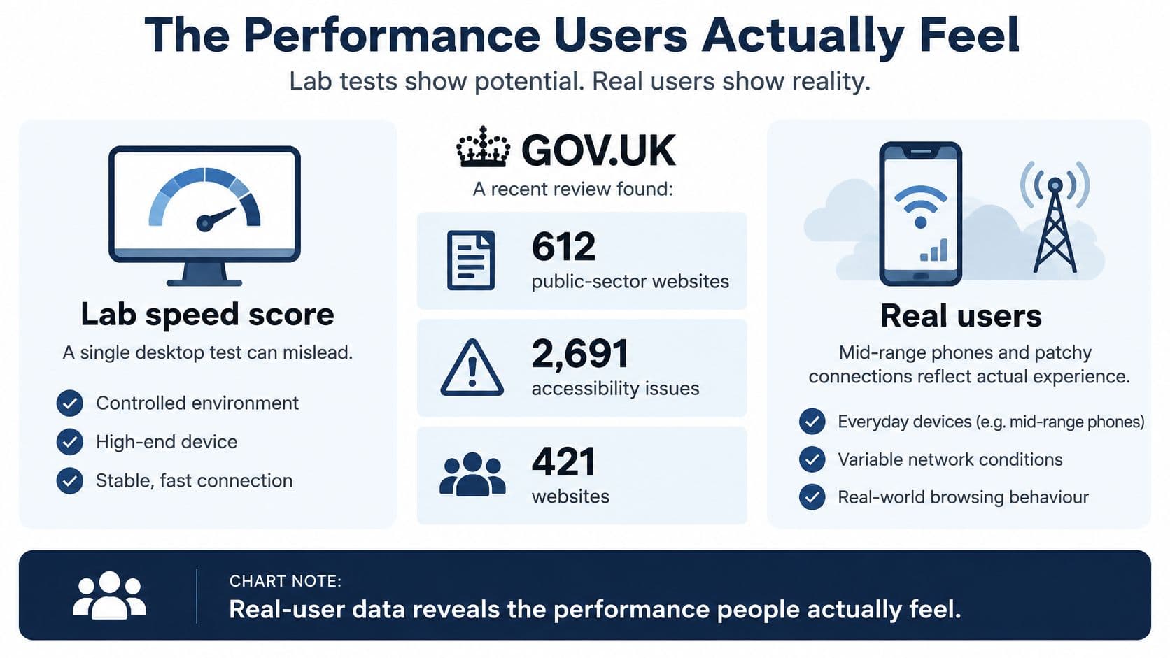
A single desktop speed score describes your test machine, not your visitors. Lab tests run on fast hardware, a clean connection, and no competing apps. Real customers arrive on mid-range phones, on trains, with a patchy signal and a dozen tabs open. Premium website design has to be judged on the visits people make.
GOV.UK's Real User Monitoring recorded a median page-load time of 0.455 seconds across all pages and devices in April to May 2022, and its analysis found 83% of visitors experienced a load time of one second or less. Field data beats a best-case lab run because it includes the slow devices and weak connections your analytics already show.
The three Core Web Vitals to watch
- Largest Contentful Paint: time until the main content appears. Good is 2.5 seconds or less at the 75th percentile.
- Interaction to Next Paint: delay between a tap or click and the visible response. Good is 200 milliseconds or less at the 75th percentile.
- Cumulative Layout Shift: unexpected movement of content during load. Good is 0.1 or less at the 75th percentile.
Judge each metric at the 75th percentile of real visits, not the median alone. A fast median can hide a checkout that crawls for the slowest quarter of customers. Our guide to testing browser performance covers the tooling and how to segment by template.
A three-step routine
- Measure field data by template: check homepage, product and checkout separately, segmented by device and connection type. A homepage that passes while checkout fails is not a performance win.
- Set a budget: cap image weight, script count and font files per template, then make new features fit inside it. Budgets turn speed into a design constraint instead of a cleanup task.
- Add regression alerts: flag any release that pushes a template past its budget before customers feel it. Speed decays through small additions, not one dramatic redesign.
The trade-off is usually visual ambition versus payload. A full-screen autoplay hero tells a story, but it also ships video to every phone whether or not the visitor wants it. Replace it with a compressed still correctly sized for the viewport, then load the video only when someone presses play. The story survives, the headline paints faster, and mobile visitors stop paying for footage they did not request.
A premium result means every money template passes its budget on a mid-range phone, not just a polished homepage on a studio laptop. That standard is measurable, maintainable and inclusive of the people who arrive on the slowest connection.
Accessibility as a Mark of Premium Craft
Visual polish doesn't guarantee inclusive use, and the evidence is blunt. The UK government's accessibility monitoring of public-sector websites covered 612 public-sector websites and found 2,691 accessibility issues across 421 tests. The most frequent categories were visible keyboard focus at 12%, accessible names, roles and values at 11%, minimum colour contrast at 11%, and keyboard operation at 8%.
Look at current premium trends and you can see how those failures happen. Pale grey text on white looks refined and fails contrast. A bespoke dropdown built from generic elements ignores the keyboard. A carousel auto-advances with no pause control. A mega menu opens on hover and never opens for touch or keyboard users at all.
Three practices at design stage
First, fix contrast in the prototype. Set body text to at least 4.5 to 1 and large text to at least 3 to 1, then test real colour combinations, including text over imagery, before development starts. Darkening a brand grey by one step rarely hurts the design. It often sharpens it.
Second, design the focus style as a component. Every link, button, field and custom control needs a visible focus state that's consistent across the design system. If your designers haven't drawn it, your developers will improvise it, and improvisation is where focus disappears.
Third, walk the journey without a pointer. Complete enquiry, checkout and account tasks using only a keyboard, then repeat with a screen reader such as NVDA or VoiceOver. You'll find trapped focus, unlabelled buttons and error messages that aren't announced, all while fixes are still cheap.
None of this flattens the design. Semantic structure, strong hierarchy and honest contrast keep typography and imagery intact while more people can use them. Our inclusive design principles cover the foundations, and the Edinburgh Council case study shows accessible delivery in a public-sector setting.
Accessibility isn't a compliance layer added at the end. It's how the craft holds up for everyone.
Finish with an accessibility statement that describes how conformance was tested, what remains outstanding and how users can report a barrier. A vague claim helps nobody.
Balancing Design Ambition With Speed and Upkeep
Every animation, video, 3D model and third-party tool adds weight, battery drain and something else to maintain. Each one has to earn its place. That discipline starts with the phone, because Ofcom reports that most time spent online in the UK is on a smartphone. Design the mobile layout first, then add desktop enhancements, rather than shrinking a desktop composition and hoping it survives.
Three swaps that keep the effect
Say a product page carries a real-time 3D viewer. On a mid-range phone it drains battery and stutters. An image sequence or short turntable video, loaded on demand when someone interacts, gives the same inspection confidence at a fraction of the cost.
A scroll-linked animation can work on the homepage, where you're setting tone. On long-form comparison pages, where readers are weighing specifications and prices, the same motion fights the reading. Keep it where it directs attention, remove it where it steals it.
Third-party tools add scripts. A chat widget, two analytics suites, and a heatmap each contribute their own. Consolidate them through one tag manager with a named owner who reviews what is still needed. Tools without an owner never get removed.
Choices that protect the finish
- A CMS with fixed components: Editors choose from approved blocks instead of free-form styling. You lose some editing freedom, and that's the point, because freedom is how layouts break.
- One shared component library: Navigation, forms, cards and calls to action are built once and reused across templates. A fix lands everywhere.
- Responsive images at build time: The system generates correctly sized, compressed versions automatically, so a phone never downloads a desktop hero.
- A single tag manager: All third-party scripts load through one controlled route, making weight visible and removable.
Upkeep is where premium fades. Define a content model with fixed components, clear image size rules and plain guidance on heading order and link text. Without those rules, well-meaning editors stretch images, stack competing banners and undo the hierarchy within months.
When a client needs to redesign an existing website, we audit the current site, identify what works and what doesn't, and build a new solution for the client's goals. That audit covers what drives enquiries, what slows pages, what editors struggle with and which features to keep.
Practical rule: Spend the performance budget where it strengthens comprehension, trust or conversion, and remove decorative weight that adds friction without measurable value.
Confirm the Brief Before Design Starts
Premium is decided before the first line of code. Teams that skip straight to visual design spend their budget discovering, during build, what the site was supposed to do. I'd sequence the work in four stages and refuse to reorder them.
The four stages in order
- Discovery: Define the audience, the three actions the site must support, and the content that proves credibility, case studies, credentials, pricing signals, named people.
- Design: Turn the scope into user flows, wireframes and a clickable prototype. The design stage turns the scope into a clickable prototype so clients can change their mind before the build is expensive to change. Test it with a small group of real users, including keyboard and mobile use. Our explainer on the website design mockup shows what to expect at this point.
- Build: Create the component library, performance budget and accessibility tests before pages are made, so every template inherits the standards instead of being retrofitted.
- Launch and monitor: Watch field data closely for the first weeks, fix regressions quickly and check real enquiry or checkout completion against the old baseline.
As a typical planning range, most website projects take 6 to 12 weeks from discovery to launch, depending on complexity, content requirements and integrations. Content is usually the long pole. If copy and imagery aren't ready, design stalls no matter how fast the build team moves.
Three questions to answer in writing
- What must the site prove to a first-time visitor within one page view?
- Which targets will be measured, meaning specific Core Web Vitals thresholds and WCAG conformance, checked in field data and manual testing?
- Who owns what at handover? Clients receive full source code transfer, hosting accounts and domain registrations for their website when the project is complete. Confirm that in writing with any studio, because ownership disputes are expensive and entirely avoidable.
Cost follows scope, integrations, number of templates and content volume, so a brief that pins those down produces a price you can trust. Vague briefs produce estimates that grow.
Send your brief through our web development service page or the contact page, with current analytics attached so the audit starts from evidence rather than opinion.
Frequently Asked Questions
How can I tell whether my current site looks premium but performs poorly
Check field data for your homepage, product and checkout templates before you look at anything visual. Compare Core Web Vitals on mobile against the good thresholds, then complete your own enquiry or checkout journey on a mid-range phone over 4G. Watch for content jumping as pages load, buttons responding late and text you have to zoom. If the screenshots impress but those journeys stall, you've got polish without performance, and the performance work should come first.
Does accessibility limit creative design
No, it shapes the design system rather than removing it. Contrast minimums, visible focus styles and keyboard operation are constraints in the same way a grid or a type scale is a constraint, and good designers work well inside them. Typography can stay expressive, imagery can stay bold and motion can stay, provided it respects reduced-motion preferences. What accessibility removes is accidental exclusion, such as pale text nobody tested or a menu that only opens on hover.
Should a premium website be redesigned all at once or in stages
Start by judging the foundation. If templates are inconsistent, the CMS fights your editors and performance fails across the board, a full rebuild is usually cheaper than patching. If the foundation is sound, phase the work, beginning with your highest-traffic and highest-value templates so improvements reach most visitors first. Either way, audit first, protect what's already driving enquiries, and never relaunch everything at once without redirect and content checks.
How often should a premium site be reviewed after launch
Review field data quarterly and act on any template that slips past its performance budget. Recheck accessibility after each significant release, because one new component can introduce a barrier across hundreds of pages. Add a content governance check at the same time, covering image sizes, heading order, link text and orphaned pages. Small, scheduled corrections cost far less than the rescue project you'll need if you let two years of drift accumulate.
About the Author
Hamish Kerry is the Marketing Manager at Arch, where he's spent the past six years shaping how digital products are positioned, launched, and understood. With over eight years in the tech industry, Hamish brings a deep understanding of accessible design and user-centred development, always with a focus on delivering real impact to end users. His interests span AI, app and web development, and the evolving potential of emerging technologies. When he's not strategising the next big campaign, he's keeping a close eye on how tech can drive meaningful change.
If your site looks the part but feels slow, fragile or hard to use on a phone, Arch can audit it against real field data, WCAG checks and your enquiry journey, then rebuild what's holding it back. Send us your brief and current analytics, and we'll show you where premium website design will earn its keep.