



What Is 3D Touch in iPhone and Why It Matters.
Learn what is 3D Touch in iPhone, how pressure sensing works, which models supported it, and how Haptic Touch replaced it across Apple's lineup.
What Is 3D Touch in iPhone and Why It Matters.
Key takeaways
- 3D Touch was Apple's pressure-sensitive iPhone interaction, introduced on the iPhone 6s in September 2015 and designed to distinguish a light press from a firmer press.
- It supported Quick Actions on app icons and Peek and Pop previews inside apps, so users could act without fully opening content.
- Apple eventually replaced it with Haptic Touch, a simpler long-press model with vibration feedback, and removed 3D Touch from the iPhone 11 line.
- For UK product teams, the practical issue is designing cleanly for both legacy pressure-based behaviour and the tap-and-hold model on modern iPhones.
- The main lesson for designers is simple, hidden gestures can feel powerful, but they're harder to discover and easier to lose if the interaction model gets too complex.
Have you ever built a feature that felt clever in the lab, then realised real users couldn't find it without help? That's the story of 3D Touch on iPhone. It was an interesting idea, a display that could tell the difference between a light tap and a firmer press, but it also became a lesson in how product teams balance power, clarity, and discoverability.
3D Touch mattered because it changed the meaning of a press. Instead of one input leading to one result, the iPhone could respond differently depending on pressure, which opened up shortcuts, previews, and deeper actions on the same screen. That sounds small. In practice, it changed how people moved through apps.
Understanding What 3D Touch Actually Does
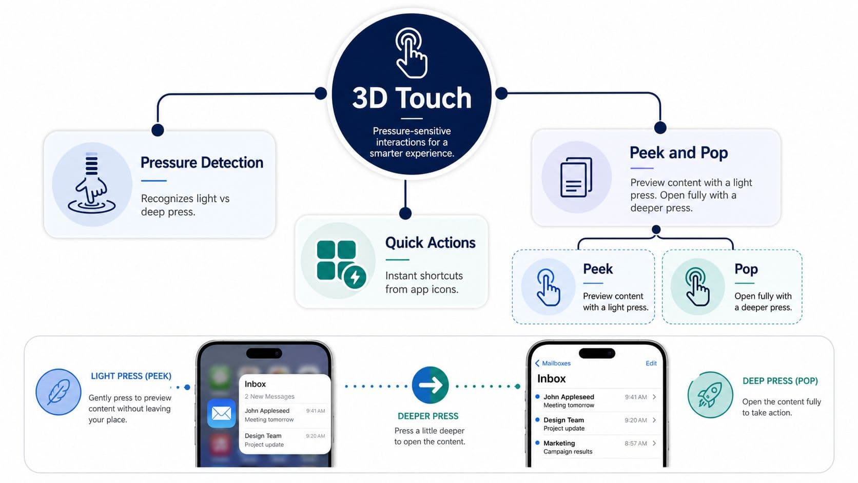
3D Touch is easiest to understand if you think about a kitchen scale. A light item doesn't register the same way as a heavy one, even though both are sitting in the same place. On supported iPhones, the screen could read how hard you pressed, then trigger a different response based on that pressure.
That's why 3D Touch was more than a fancy tap. A normal tap says, “open this.” A firmer press could say, “show me a preview,” “give me a shortcut,” or “take me deeper into the content.” Apple described it as a new display capability built on pressure sensing instead of ordinary tap input, and that distinction is the whole feature in one sentence. Apple's 3D Touch support guidance makes the same point from the developer side: pressure was part of the interaction model from the start.
Why it felt different from a long-press
A long-press waits. It gives the system time to decide what you want. 3D Touch felt more immediate because the phone reacted to force, not just duration. Apple's launch material explained that the display detected how hard you pressed, with a light press opening a preview and a harder press opening the content fully, while the Taptic Engine confirmed the action with a small vibration. Apple's launch explanation of 3D Touch shows why users often described it as more tactile than a conventional hold.
That immediacy is part of why teams liked it. A user could move from browsing to previewing without leaving the current screen, which reduced context switching. It also meant the interaction sat closer to the content itself, instead of hiding in a separate menu or button.
Practical rule: if a gesture needs explanation before a user can trust it, it's already carrying a discoverability problem.
For design teams, the important mental model is simple. 3D Touch = pressure-sensitive branching, which goes beyond a stronger tap. Once you've got that, the rest of the feature, hardware, API, timeline, and eventual replacement starts to make sense.
How Pressure Sensing Works Under the Glass
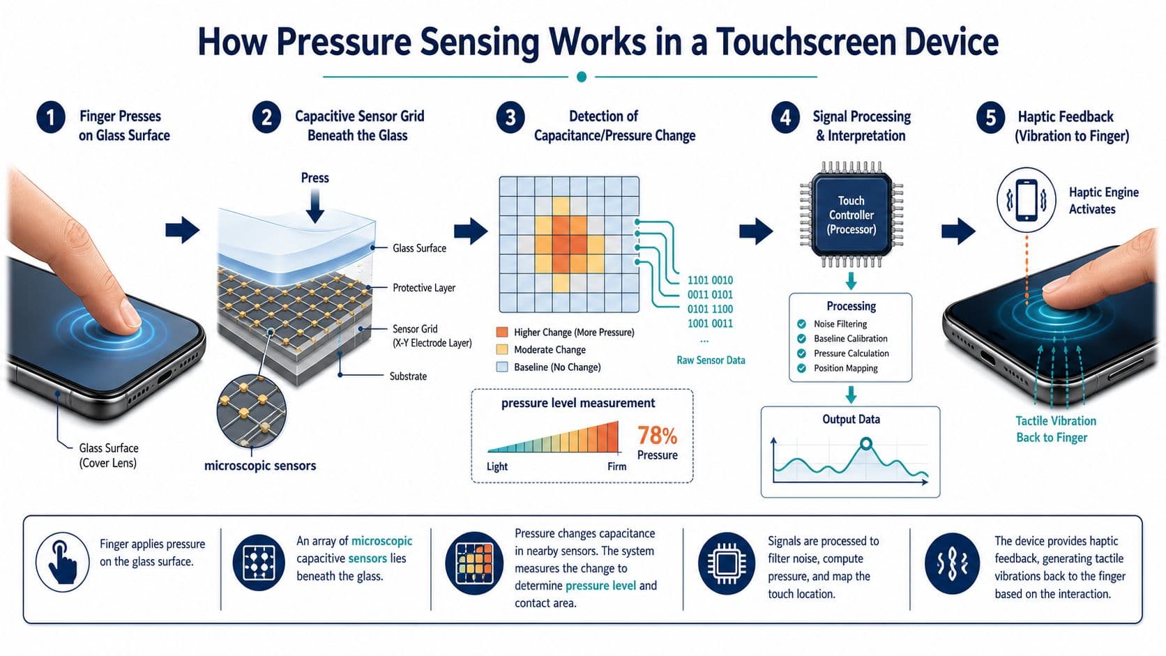
The iPhone 6s launch described capacitive sensors integrated into the Retina HD display, measuring microscopic changes in the distance between the cover glass and the backlight. That's a hardware trick, not a software illusion. It gave the device a way to recognise pressure as a real signal instead of guessing from touch duration. Apple's launch explanation is the clearest public description of that stack.
The hardware and software had to work together
The hardware only mattered because iOS could read it. Apple's iOS 9 API exposed two pressure-related properties on UITouch, force and maximumPossibleForce, which let apps read continuous touch pressure instead of just knowing whether a touch had started or ended. That's the engineering reason 3D Touch could distinguish a light press from a deep press with such precision. Apple's archived developer documentation is the authority marker for that API layer.
The Taptic Engine completed the loop. Apple said it could reach peak output in one cycle, which made very short haptic events possible, such as a 10 ms mini-tap and a 15 ms full tap. That short feedback matters because it keeps the interaction feeling tightly coupled to the user's finger. If the vibration comes too late, the gesture feels vague. If it comes immediately, the brain reads it as a single action.
The easiest way to explain the full system is this. The screen senses pressure, iOS interprets it, then the phone answers with haptics and a different UI state. That is why 3D Touch felt more physical than a basic menu reveal. It wasn't only visual.
Why the engineering detail mattered to design
For product and design teams, the point isn't to remember the sensor stack. The point is to understand that the interaction was calibrated around pressure thresholds, not time. That made the experience feel premium on supported hardware, but it also added complexity. Every model variation and every gesture expectation had to line up, or the feature would feel inconsistent.
The hardware was doing subtle work the user could feel, but not explain. That's often the mark of a good input system, and also the reason it's expensive to ship.
iPhone Models and the Timeline of 3D Touch
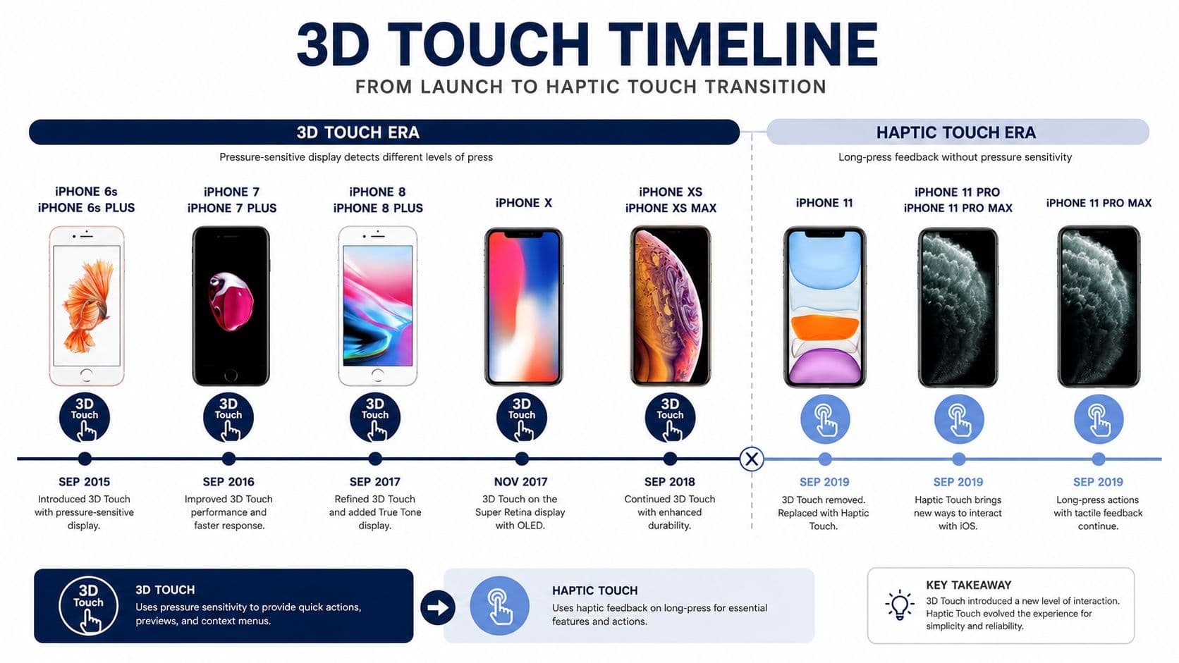
Which iPhone models carried 3D Touch, and where did Apple draw the line? The feature arrived with the iPhone 6s in September 2015, so that release is the clean starting point for any history of it. Apple's own archived support material for the feature was published alongside iOS 9 guidance in 2015, which shows when app teams were first expected to design for pressure-aware input in real products.
From there, 3D Touch spread through Apple's flagship range for a while before the company shifted direction. Independent references place support on models from the iPhone 6s through the iPhone XS and iPhone XS Max, and identify the iPhone XR as the first new iPhone lineup member to ship without it. Apple's move away from pressure sensing became clearer in the iPhone 11 generation, where Haptic Touch replaced 3D Touch on new hardware. TechTarget's overview of 3D Touch and 9to5Mac's history note on Apple phasing it out help anchor that shift.
The part product teams often miss
The last devices to support 3D Touch were the iPhone XS and iPhone XS Max, both from 2018. For British iPhone users, that means legacy pressure-based behaviour can still matter on older handsets, but it cannot be assumed on newer ones. The user base is mixed, and the input model changed underneath it.
That matters for support decisions as much as for design decisions. If you are helping someone judge whether an older handset still has practical value, it helps to look at the device in the context of a broader trade-in decision, such as trade in your iPhone 8, especially when you are weighing whether older input behaviour still affects day-to-day use.
Apple's later hardware story also helps place the shift in context, including the company's recent event coverage around the iPhone line, such as Arch's highlights of the iPhone 13 launch event. That kind of product transition is the point to notice, because interaction changes are rarely isolated. They are usually folded into a wider hardware and software reset.
For app teams, the timeline is a design lesson. A British iPhone user on an older device may still expect pressure-based shortcuts. A user on a current model probably will not. The right approach is to keep the same app behaviour understandable on both, so the experience does not split into two separate products.
Quick Actions and Peek and Pop in Everyday Use
The most visible part of 3D Touch was what happened on the Home screen. Press firmly on an app icon, and the phone could open a contextual menu of shortcuts. That might mean composing a message, jumping to a frequent screen, or starting a selfie without opening the app first. Apple's own guidance described this as accessing previews, shortcuts, and more, which is a neat summary but not very human. The human version is simpler. The app let you skip the front door.
Quick Actions on the Home screen
The value of Quick Actions was speed with intent. If someone already knew they wanted to message, post, search, or capture something, the icon press collapsed several steps into one. Pocket-lint's coverage of the feature gives a good everyday example of how pressing an app icon could reveal a menu of shortcuts such as composing a message or taking a selfie. Pocket-lint's explanation of 3D Touch Quick Actions is useful because it describes the user-facing outcome rather than the implementation detail.
That design pattern is still relevant. Users like shortcuts, but only when the shortcut matches a common task. If a shortcut menu guesses badly, it becomes clutter. If it lines up with what people already do, it feels like the app is saving them time.
Peek and Pop inside apps
Inside an app, the flagship pattern was Peek and Pop. A light press on a link, message, or location could preview the content without leaving the current screen. Press a little harder, and the content opened fully. Apple's iPhone basics guidance says to press firmly on an item or icon instead of tapping it, then the phone responds with a preview, menu, or shortcut rather than a normal open action. Apple's iPhone basics guide to 3D Touch captures that behaviour in plain language.
The mental model is important for design. The user isn't navigating away, they're checking whether the content is worth the full jump. That's why the interaction felt useful in mail, maps, messages, and web links. It let people sample before committing.
If you're deciding whether to preserve anything from that pattern, keep the underlying goal, not the pressure mechanic. The goal was fast discovery without context loss. Modern long-press menus can still do that job, even if they don't feel quite as immediate.
3D Touch Compared to Haptic Touch
3D Touch and Haptic Touch can look similar in a product spec, but they solve the interaction problem in different ways. 3D Touch depends on pressure. Haptic Touch depends on time, meaning a long press with vibration feedback. That one change affects how people discover it, how engineers implement it, and which devices can support it.
What changed for users
Haptic Touch is easier to explain because the pattern already exists elsewhere in mobile UI. People are used to pressing and holding to reveal a menu or preview, so support teams do not have to teach a hidden layer from scratch. 3D Touch asked users to discover a separate pressure-based gesture, which made adoption uneven, as noted in Nielsen Norman Group's analysis of 3D Touch.
For current UK iPhone users, that matters more than nostalgia. Modern devices use Haptic Touch, so pressure-first onboarding will only fit a smaller set of older phones. Start with long-press, and the interaction matches what many users already have in front of them.
How the two feel different
3D Touch had a layered feel. A light press gave one response, then a firmer press gave another, so the interface felt as if it had depth built into the screen. Haptic Touch is flatter. It still gives feedback, but it does not separate shallow pressure from firm pressure, so the light-press and deep-press distinction disappears.
Design implication: Haptic Touch is easier to learn, while 3D Touch was easier to feel. Those are not the same thing.
Apple's decision tells a clear product story. The company did not keep a hidden gesture layer simply because it was clever. It simplified the interaction model so the same pattern could work more consistently across devices. That is the lesson to carry into mixed-fleet design today.
For app teams, the rule is straightforward. Design for Haptic Touch first, then keep pressure-sensitive behaviour only where it still makes sense on older supported devices. If you are checking the accessibility side of that decision as well, Arch's accessibility overview is a useful companion when you need to design for different abilities and different iPhone generations without splitting the experience.
Accessibility, Settings, and Testing Across Devices
Any gesture that depends on force or timing needs an accessibility check, not just a visual polish pass. Apple included a 3D Touch sensitivity setting in iOS because people do not all press in the same way. Some users needed a lighter threshold, some needed a firmer one, and some were better served by the long-press alternative that replaced the feature on newer phones.
That matters for motor accessibility. If a user has trouble producing consistent pressure, the gesture stops being a shortcut and starts acting like a barrier. Haptic Touch helps here because it shifts the interaction from force to duration, which is often easier to repeat predictably. For broader accessibility context, pair gesture decisions with Arch's accessibility overview, especially when your app has to behave sensibly across device ages and user needs.
A useful way to review this is to ask one simple question. Can the same action be reached without forcing the user to learn two different interaction rules? If the answer is no, the design is already asking too much of people who are just trying to get a task done.
A practical testing checklist for mixed device fleets
A good UK QA setup does not need dozens of phones, but it does need the right spread. Keep at least one older iPhone that still supports pressure input, then check the same flow on a current model that only uses long-press. Make sure the outcome is identical, even if the gesture path is not.
Treat the phone like a door with two handles. One handle may press inward, the other may just need a hold, but both should open the same room. If one path produces a different result, users will notice the inconsistency before your release notes explain it.
- Check the entry point: confirm the shortcut or preview is visible and understandable on both legacy and modern devices.
- Test the fallback: if pressure is not available, the long-press path should reach the same action without extra friction.
- Review onboarding copy: users should not need to guess whether they are meant to press firmly or hold.
- Verify assistive flows: if a gesture is hard to perform, the app still needs another route to the same result.
If you are using TestFlight, give QA a device matrix that includes the oldest handset you still support and the newest iPhone your audience is likely to own. That is enough to expose whether a feature is tied too tightly to one interaction style. A gesture that only works well on one model is a support risk, not a feature win.
Designing for Mixed iPhone Fleets as a Developer
How should an iPhone app behave when one device can sense pressure and the next can only recognise a hold? The safest approach is to detect capability first, then show the interaction the phone can support. On iOS, that means checking the trait environment and the device's force capability, then routing users into pressure-based behaviour or a long-press fallback.
The pattern should stay boring in the right way. A pressure-capable device can surface a richer gesture, while a modern handset without 3D Touch still reaches the same outcome through a press-and-hold path. Users should not have to learn two different ways to complete the same task just because the hardware changed.
Keep one source of truth for the action
Do not build two separate shortcut systems. Keep one menu, one preview, one action handler, then send both gesture paths into that same logic. That keeps the behaviour aligned across older and newer phones, and it reduces the sort of drift that makes mixed-device apps hard to support. If the pressure path and the long-press path split apart, support teams end up tracing tiny differences instead of improving the product.
Nielsen Norman Group's point about 3D Touch being a hidden gesture layer still matters here. A hidden gesture can feel elegant, but only if people can discover it without guesswork. A fallback is not a lesser version. It is the part that keeps the system understandable when a device does not support pressure input.
Use progressive disclosure carefully
A shortcut should appear only when it helps the task. Do not attach pressure or long-press behaviour to every object just because the framework allows it. Start with the actions people repeat most often, then make the trigger clear enough that nobody needs an internal manual to find it. If your app still supports pressure for legacy devices, the handoff to the fallback should feel like the same design, just through a different gesture.
That is also where our guide to building iPhone apps helps teams make better decisions. Strong apps do not rely on cleverness for its own sake. They make the main path obvious, then add shortcuts only where they reduce effort. 3D Touch is a good design lesson because it shows how to keep that balance.
For a UK audience with a mixed iPhone fleet, treat pressure support as an extra layer, not the base model. The base should be one readable interaction design that still makes sense when the hardware underneath it changes.
What 3D Touch Teaches Product Teams Today
3D Touch is better remembered as a trade-off than as a gimmick. It showed that Apple could make touch feel deeper and more expressive, but it also exposed the cost of hiding power behind a gesture people had to learn. When Apple replaced it with Haptic Touch, it was choosing clarity over interaction novelty, and that's a useful design signal.
The lesson for modern product teams is direct. Build for discoverability first, then add richer gestures only if they survive real use. If your users can't find the feature without help, the feature's cleverness is working against you.
For teams shipping iPhone experiences now, that means designing around what current devices do, then preserving legacy behaviour only where it improves outcomes. If your mobile roadmap needs that kind of clarity, Arch's mobile app services are a sensible place to start.
If you're designing an iPhone app and want pressure-sensitive ideas translated into a clearer, more current interaction model, Arch can help you shape the right approach. Visit Arch to talk through mobile app design, build, and accessibility decisions that fit real device fleets, not just one model of them.
About the Author
Hamish Kerry is the Marketing Manager at Arch, where he has spent the past six years shaping how digital products are positioned, launched, and understood. He has over eight years in the tech industry and a deep understanding of accessible design and user-centred development, with a focus on delivering real impact to end users. His interests include AI, app and web development, and the potential of emerging technologies. Outside campaigns, he keeps a close eye on how tech can drive meaningful change.
Hamish's LinkedIn: https://www.linkedin.com/in/hamish-kerry/