



Website Design for Lead Generation: A Practical Playbook.
Actionable website design for lead generation strategies covering UX, CTAs, forms, mobile, analytics, and A/B testing for UK businesses.
Website Design for Lead Generation: A Practical Playbook.
Key takeaways
- More form fills are not the goal. A strong lead-generation site filters, qualifies, and routes enquiries so sales teams spend time on the right conversations.
- The hero section has one job. State one outcome, show one primary CTA above the fold, and remove competing actions that dilute intent.
- Short forms beat ambitious forms at first touch. Use progressive profiling and qualification questions after trust has been earned, not before.
- Mobile is the default browsing environment. UK lead-gen pages need fast loading, thumb-friendly CTAs, tappable phone numbers, and forms that work cleanly on a phone.
- Measurement should track lead quality, not just volume. Instrument form submissions, calls, and high-intent page views, then review them weekly.
- Good website design for lead generation is a system. It should connect discovery, structure, forms, mobile performance, and testing into one conversion path.
Most advice about website design for lead generation starts in the wrong place. It talks about buttons, colours, and form length before it asks the more important question, which is whether the site is attracting the right enquiry in the first place. A page can collect plenty of names and still fail the business if those names turn into wasted follow-up, awkward qualification calls, and deals that were not a fit.
That failure mode is common in UK service businesses. The website is treated like a brochure, when it should behave more like a filter and routing system that helps serious buyers move forward and slows down poor-fit leads. In practice, that means the design has to do more than look credible. It has to make the next step obvious, reduce friction for the right visitor, and create just enough resistance for the wrong one to self-select out.
The value proposition is the first place that gets muddled. If the offer is vague, the CTA is generic, and the form asks for too much too soon, the site ends up optimising for noise instead of pipeline. A clearer way to think about this is simple, the page should make the buying decision easier for qualified visitors and harder for everyone else. That shift changes how you design the whole experience, from headline to handoff. For a sharper definition of that offer-led thinking, see value proposition clarity.
Routing and qualifying enquiries sometimes needs more than a form plugin, and Arch's web app developers build the tools that sit behind a lead-generation site.
Why Most Lead Generation Websites Leak Revenue
The biggest leak usually isn't traffic, it's lead quality. Teams celebrate when enquiries rise, then discover the sales queue is full of people who wanted price shopping, generic advice, or a service the business doesn't even want to sell. That's not a marketing win. It's a routing problem.
UK audiences are now far more comfortable making commercial decisions online. The Office for National Statistics reported that UK internet sales accounted for 36.0% of all retail sales in January 2021, up from 20.0% in January 2020, which shows how quickly decision-making moved into online journeys (ONS data discussed in this guide). The same shift raised expectations everywhere else too. Buyers now expect clarity, speed, and a self-service path with little sales pressure.
Why generic conversion advice underperforms
Most generic advice repeats the same three moves, add a CTA, shorten the form, add testimonials. Those are not wrong, only incomplete. They can still produce the wrong leads if the site does not define who should convert and who shouldn't.
Practical rule: if every visitor sees the same offer, the site is probably built to collect attention, not qualify demand.
The better model is to design the website around the outcome the business wants, not raw enquiry volume. A service firm with limited capacity may prefer fewer, better-fit leads over a flood of low-intent submissions. That sounds obvious, but the web often pushes teams in the opposite direction because everyone can see the form count, while lead quality is harder to read without discipline.
That's why effective lead-gen sites feel opinionated. They make the offer explicit, reduce ambiguity, and leave enough clues for the right prospect to keep moving. They also create controlled friction where needed, so a poor-fit lead doesn't get accidentally ushered into a sales conversation that was unlikely to close.
The page should therefore behave like a pre-qualification layer. It isn't there to persuade everyone. It's there to identify the people worth spending time on, then route them to the most appropriate next step.
Discovery and Audience Mapping Before Any Pixels Move
Good website design for lead generation starts long before a layout is mocked up. The first task is to define the primary conversion outcome, because “enquiries” is usually too broad to be useful. A callback request, demo booking, consultation, or quote request all imply different levels of intent, different follow-up processes, and different qualification rules.
A useful discovery session produces one clear brief, not a pile of opinions. Start with stakeholder interviews, but keep them focused on commercial reality. Ask which leads close well, which ones waste time, which service lines are most profitable, and where the sales team sees avoidable drop-off. Then turn those answers into a one-page audience map.
Build the audience map around behaviour
The map should pair jobs-to-be-done with buying triggers. A visitor might be trying to solve an urgent problem, compare providers, or check whether the business is credible enough to contact. Those are not the same intent states, and they shouldn't all be treated with the same message.
A lightweight structure works well:
- Define the primary conversion goal. Choose one measurable action for the site to optimise around.
- Identify the core audience segments. Group by intent, need, and buying stage, since vague demographics tell you little.
- List the buying triggers. Capture the moments that make someone ready to enquire, such as a time-sensitive problem or a service gap.
- Write disqualifying criteria. Decide what makes a lead poor-fit, then design the site to reveal that early.
Competitor teardown helps here, but don't stop at visual style. Look at how competitors frame their offer, what they promise on the first screen, and whether they make the user work too hard to understand who the service is for. The useful insight is rarely about colour or typography. It's about positioning, proof, and the shape of the conversion path.
For a clean research input, I also like to pressure-test the offer with market research framing before anyone opens Figma. That keeps the team honest about what the market needs and what stakeholders only hope the homepage should say.
Keep the brief brutally short. If the team can't state the primary conversion goal, audience, and disqualifying criteria on one page, the design work is too early.
Information Architecture and Above The Fold Mechanics
Once the conversion goal is clear, the page structure has to support it. A homepage for lead generation should not behave like an open-ended brochure with equal weight given to every service, case study, and company detail. It needs a hierarchy that pushes the visitor towards one action and keeps other paths secondary.
The simplest rule is also the most useful, one primary conversion action per page. That doesn't mean the site can only have one destination overall. It means each page should be designed around a single measurable outcome, then use navigation and supporting content to reinforce that path. If a service page is trying to sell, educate, and recruit all at once, the attention budget gets spent too quickly.
Restructure the hero around the outcome
The hero section should state the result, not the company history. A weak hero says who the business is. A stronger one says what problem it solves and what the visitor should do next. The CTA belongs in that first view, immediately after the benefit statement, because users are most likely to act when the next step is visible without hunting for it. This approach fits with user interface design, where clarity and visual priority matter more than decorative density.
Natural decision points matter too. Repeat the CTA after proof, after the main benefits, and at the end of the page. That repetition is not clutter when the page is trying to guide a decision. It gives the visitor more than one chance to act once they're ready.
A typical service-business homepage often has too many links in the main menu, a hero that leads with company heritage, and a contact button that gets visually lost. Prune it down. Keep the primary menu tight, reduce competing pathways, and make sure key pages are reachable within three clicks. The point isn't minimalism for its own sake, it's reducing the effort needed to find the next conversion step.
If the site feels like a maze, the visitor will browse. If it feels like a guided route, the visitor is far more likely to enquire.
Forms, Progressive Profiling and Lead Qualification
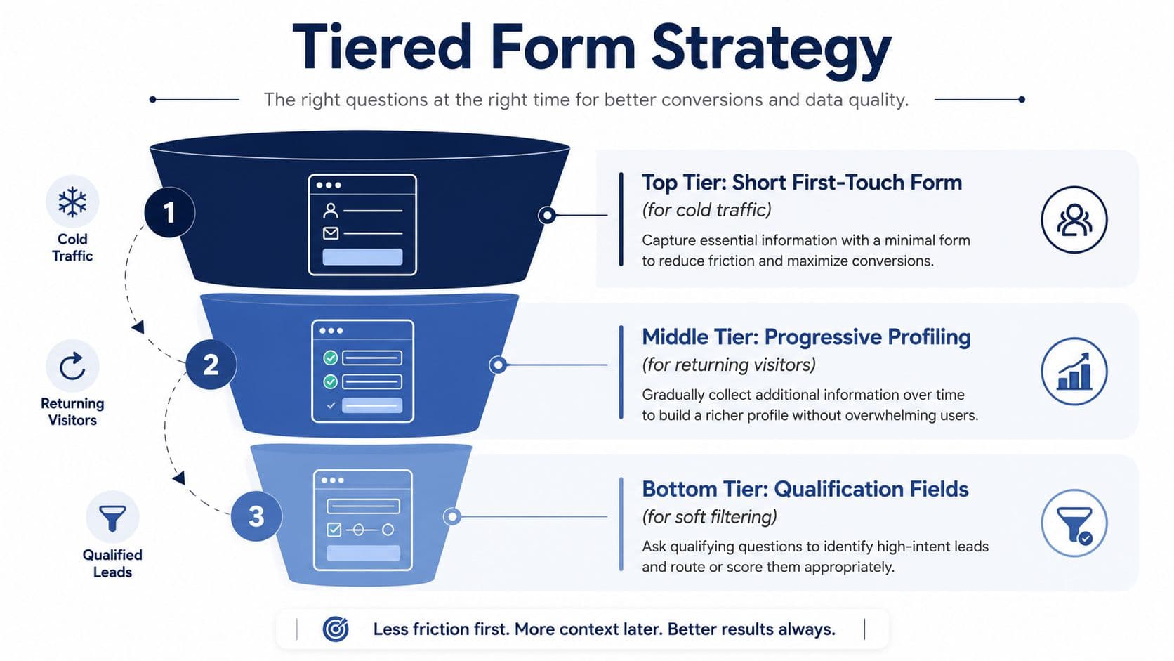
Forms are where a lot of lead-gen thinking breaks down, because teams keep optimising for volume instead of fit. Short forms can fill a CRM with weak enquiries, while long forms can suppress the right ones before they ever see value. The better approach is a tiered form strategy that uses the website to filter, qualify, and route people by intent.
The first-touch form should stay light. For cold traffic, name, email, and one qualifying field is often enough, because the job at that stage is to start the conversation without forcing the visitor to prove themselves too early. Returning visitors can be asked for more detail later through progressive profiling, which lets each interaction add context without making the first step feel heavy.
A lot of service sites get this wrong by treating every enquiry as if it needs the same level of scrutiny. It does not. A visitor who clicked a trusted referral is usually ready for a different form experience from someone arriving through a broad search term, and the form should reflect that difference.
Use qualification as soft filtering
Qualification fields work well when they help the visitor as much as they help sales. One or two questions can be enough if they route the lead properly, set expectations, or cut out enquiries the team cannot take on. Project type, urgency, budget band, and team size are all common options, but the right fields depend on what the business needs to know before responding.
For inspiration, high-converting lead forms are useful because they show how stronger forms strip out dead weight and make the next step obvious. Copying patterns blindly rarely helps; the useful part is seeing how strong forms reduce hesitation while still collecting the information that matters.
For businesses with limited sales capacity, a disqualifying question can save time and protect the pipeline. If the service only makes sense above a certain scope, ask about scope early. If the lead is too small, too early, or outside the service area, the form should route them elsewhere or make the boundary clear before anyone on the team wastes time chasing a dead end.
That routing logic matters more than a lot of generic advice admits. A form can do three jobs at once, capture contact details, qualify the enquiry, and send the person to the right next step. When it does, the website stops acting like a brochure and starts behaving like a filtering system.
If the form is built well, it becomes part of the sales process. It does more than collect details. It tells the business who this person is, how serious they are, and what should happen next.
Mobile Performance and Accessibility as Conversion Levers
A lead generation site that loads slowly on mobile is already filtering, just in the wrong direction. UK browsing behaviour makes mobile design a commercial issue, not a nice-to-have. Ofcom reported that adults in the UK now spend the majority of their internet time on smartphones, and its 2025 media-use data shows mobile remains the dominant everyday access point for online activity (Ofcom-led guidance summarised here). For service businesses, that means the first job is to keep qualified visitors moving, not make them work for basic actions.
That changes the design brief. CTA buttons need to be thumb-friendly, phone numbers should be tappable, and forms should work without zooming or hunting for fields. If a visitor has to pinch and pan to enquire, the page has introduced avoidable friction. On a service site, that friction usually lands straight in the sales pipeline, because the people who were ready to enquire are the ones most likely to give up first.
Speed and accessibility do not sit outside conversion. They shape it.
A practical benchmark used in service-firm lead generation is a load time under 3 seconds and PageSpeed scores above 85 on both mobile and desktop (mobile performance guidance). That target is useful because it keeps the page responsive enough that qualified visitors can reach the form before impatience sets in. It also forces trade-offs early, which matters more than chasing polished visuals that slow the page down.
The audit sequence should stay disciplined, but not formulaic. Start with real-world speed, because desktop tests hide a lot of mobile pain. Compress images, since large files are usually the easiest win. Enable caching so repeat visits load faster. Minimise code and strip out scripts that do not help the enquiry flow. Then test on real devices, because emulators miss touch, keyboard, and submit problems that show up on actual phones.
Accessibility helps conversion because clarity helps everyone complete the journey faster. Good contrast, readable labels, and a clean heading hierarchy make forms easier to scan in a hurry. That matters on mobile, where attention is split and the screen gives you less room to recover from ambiguity.
Test the site on the phone in your hand, not just in a browser window. A form that looks fine on a laptop can still fail when someone tries to tap, type, and submit with one thumb.
Strong teams review the mobile path like a sales flow. They check where the CTA first appears, what happens after the tap, how long the page stays responsive, and whether a call path is clearer than a form on some pages. If those answers are fuzzy, the site is probably losing enquiries on the exact device most visitors use. For a useful primer on the reporting side, how to credit sales channels helps frame the follow-up work that sits behind the mobile experience.
Analytics, Attribution and A/B Testing That Actually Compounds
A lead generation site should be judged on lead quality, not on how busy the dashboard looks. If the measurement setup cannot show which pages and channels produce qualified enquiries, it is doing decoration work. Track a narrow set of events that map to commercial intent, then review them on a regular cadence.
Start with form submissions, phone clicks, and high-intent page views. Those are enough to show where interest turns into action, and where people stall before they reach sales. If the tracking plan gets much broader than that, small teams usually end up with noise instead of decisions.
Attribution needs to be practical as well. The reporting system has to help sales and marketing agree on what to improve next, not add another reporting tool nobody opens. For a useful primer on how to credit sales channels, how to credit sales channels is worth reading with a practical eye.
Testing works well when it follows friction, not taste.
If visitors land on the page and leave before the form, the test should look at the headline, the CTA wording, or the order of fields. If mobile users drop off early, spacing, layout, and button clarity are usually the first things to inspect. Cosmetic changes rarely move the business metric that matters, so the hypothesis has to point at a real leak in the enquiry path.
A small weekly review is usually enough for UK service businesses that do not have a full analytics team:
- Form completion rate shows whether the capture flow is working.
- Qualified lead rate shows whether the site is attracting the right enquiries.
- Source attribution shows which channels bring useful traffic.
- High-intent page views show which pages support conversion without closing the loop.
The backlog should stay lightweight. Keep one row for the issue, one for the hypothesis, one for the change, and one for the success metric. That simple structure stops random tweaks from piling up and makes each test teach something useful.
Templates, KPIs and a 30-Day Rollout Roadmap
A useful lead-gen site doesn't need dozens of moving parts. It needs a small number of pages that do their jobs cleanly. A good baseline for a UK service business is a homepage that clarifies the offer, service pages that route by intent, a contact or booking path that qualifies properly, and proof content that reduces hesitation.
The KPIs should match that structure. Track the metrics that reveal lead quality and page performance, not a vanity dashboard full of numbers nobody uses. The right scorecard usually includes enquiry volume, qualification rate, form completion rate, phone click rate, and source quality by channel. If a page brings traffic but not good leads, it's underperforming no matter how polished it looks.
A practical 30-day rollout
The fastest way to improve a lead-gen site is to run it as a staged project, not a giant redesign. Week one belongs to discovery, audience mapping, and offer clarity. Week two moves into page structure, CTA hierarchy, and form planning. Week three covers design and build, with mobile testing and analytics setup layered in. Week four is for launch, observation, and the first round of tests.
If the brief can't state the primary conversion goal, the disqualifying criteria, and the handoff path, the rollout isn't ready yet.
The main sentence to keep in mind is this. Design the site to filter, qualify, and route, not just to collect. That's the difference between a brochure and a system that supports sales.
For teams that want help turning that into a working website, Arch offers discovery and web development support that fits conversion-led projects. The right engagement is the one that starts with the offer, not the pixels.
FAQs
What makes a website good for lead generation?
A good lead-generation website makes the next step obvious and low-friction for the right visitor. It needs a clear value proposition, a single primary CTA, short forms, and proof that reduces hesitation. The site should also qualify enquiries instead of collecting everything indiscriminately. In practice, the best pages help serious buyers move forward quickly while filtering out poor-fit leads before they reach sales.
Should I always keep forms as short as possible?
Short forms are usually best at first touch, but “short” doesn't mean “blind.” Ask only for the details needed to contact and qualify the lead, then use progressive profiling later if the visitor returns. If a business has limited capacity or strict fit criteria, a slightly longer form can be useful, provided every field earns its place. The goal is balance, not minimalism at any cost.
How important is mobile design for lead generation websites?
It's central, because mobile is the default browsing environment for many UK users. CTA buttons need to be easy to tap, forms should work on small screens, and phone numbers should be clickable. If a visitor has to zoom, scroll awkwardly, or fight the layout, conversion drops fast. Mobile design is no longer a separate consideration, it's part of the core sales flow.
What should I track after launching a lead-gen site?
Track form submissions, phone clicks, high-intent page views, and source attribution. Those events tell you whether the site is generating useful demand or just noise. Add qualification data too, so you can see whether the leads are worth the sales team's time. Weekly reviews are usually enough to spot patterns and decide which pages or channels need improvement.
How do I know if my site is attracting the wrong leads?
You'll usually see it in sales follow-up. If the team keeps speaking to people outside your service scope, below budget, or too early in their buying journey, the site is probably too broad. That usually means the headline, form, and qualification path aren't filtering clearly enough. A better site doesn't just increase response, it makes the right response more likely.
About the Author
Hamish Kerry is the Marketing Manager at Arch, where he's spent the past six years shaping how digital products are positioned, launched, and understood. With over eight years in the tech industry, Hamish brings a deep understanding of accessible design and user-centred development, with a focus on delivering real impact to end users. His interests span AI, app and web development, and the potential of emerging technologies. When he's not strategising the next big campaign, he's keeping a close eye on how tech can drive meaningful change.
Hamish's LinkedIn: https://www.linkedin.com/in/hamish-kerry/