


Website Design for Startups: Convert More With a Winning Startup Site.
Discover website design for startups that converts visitors into customers. Learn MVP scoping, UX design, and the best tech choices for growth.

High conversion startup website design.
Key Takeaways
- Strategy First: Define your target audience, unique value proposition, and business goals before any design work begins. A solid strategy is the foundation of a successful website.
- Embrace the MVP: Launch a Minimum Viable Product (MVP) focused on solving one core user problem. This gets you to market faster and allows you to iterate based on real user feedback.
- Mobile-First is Mandatory: Design your website for the smallest screen first to ensure a seamless experience for the majority of your users, which is crucial for engagement and conversions.
- UX and UI Drive Trust: A clean User Interface (UI) and an intuitive User Experience (UX) are essential for building credibility and guiding visitors smoothly towards your conversion goals.
For founders drowning in a sea of to-do lists, a great website isn’t about ticking every feature box from day one. It’s about launching something focused and genuinely useful—a platform that solves a real problem and immediately starts building trust. The best websites for startups prioritise a clear strategy long before a single line of code is written, embracing a lean, mobile-first approach to drive actual growth.
The Core Principles for a Startup Website That Works
To build a website that genuinely helps you grow, you need to stick to the fundamentals and avoid getting bogged down in the small stuff. A successful launch is always the result of a disciplined, user-focused process.
Think of it like this—these are the pillars holding everything up:
- Strategy First, Design Second: Before anyone even thinks about pixels, you need a rock-solid strategy. That means knowing exactly who you’re talking to, what makes you different, and what you need your website to achieve in measurable terms.
- Launch Faster with an MVP: Forget trying to build your dream website all at once. A Minimum Viable Product (MVP) strips everything back to the absolute essentials needed to solve your customer's biggest headache. This gets you to market quickly, so you can start gathering real feedback to inform what you build next.
- Mobile-First is Non-Negotiable: Let's be realistic—most of your audience will find you on their phones. Designing for the smallest screen first guarantees a seamless experience for every single visitor, which is crucial for keeping them engaged and turning them into customers.
- Great UX Builds Trust (and Drives Conversions): A great User Experience (UX) is more than just pretty visuals. It’s about creating a smooth, intuitive journey that helps people get what they need without any friction. When you get this right, you build credibility and make it easy for them to say yes.
This simple flow chart maps out the process, moving from the initial thinking to the final user experience.
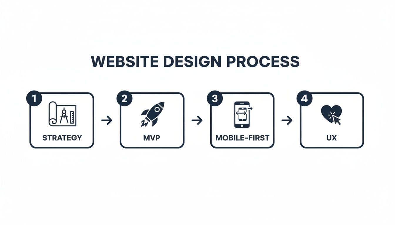
The key takeaway here is that a successful website isn't a happy accident. It’s built on a logical foundation where each step informs the next, making sure the final product is both purposeful and effective.
Laying the Strategic Groundwork for a Website That Works
A winning startup website isn't about chasing design trends or writing clever code. It's built on a rock-solid strategic foundation. This first phase—what we call discovery—is where you turn big business goals into a tangible plan, making sure every pixel and every line of code serves a purpose. It's about getting past your own assumptions to build a site that actually connects with your audience and starts driving growth from day one.
The whole process kicks off by getting brutally honest about your mission and, more importantly, your customer. You need to dig deeper than basic demographics and sketch out a genuine profile of your ideal user. What are their biggest headaches? What gets them excited? Where do they hang out online? Answering these questions is the bedrock for creating a website that speaks their language and solves their problems.
Pinpoint Your Purpose and Your People
To build a website that resonates, you first have to be crystal clear on who you're building it for and what you want them to do. This clarity stops you from building a generic, one-size-fits-none website that tries to talk to everyone and ends up talking to no one. It's the difference between shouting into the void and having a real conversation with a potential customer.
Start by mapping out a detailed user persona. This isn't just about age and location; it's about understanding their goals, their frustrations, and the real ‘job’ they're hiring your product to do.
A few key questions to get you started:
- What is the single biggest problem we solve for our users? This sharpens your messaging.
- What are their primary motivations and frustrations? This shapes the emotional tone of your design and copy.
- What information do they need to make a decision? This dictates your content hierarchy and the paths you build through your site.
Once you have this profile, every single decision—from the headline on your homepage to the colour of your CTA button—can be weighed against it. Does this help that person? If not, rethink it.
Scope Out the Competition to Find Your Opening
Next, it’s time to size up the competition. The goal here isn’t to copy what everyone else is doing; it’s to spot the gaps and find your opening. Look at your competitors' websites with a critical eye. What are they doing well? And, more importantly, where are they dropping the ball?
A proper analysis will show you patterns in messaging, user experience, and features. Maybe a competitor’s checkout process is a nightmare, or their core value proposition is buried under a mountain of jargon. These are your opportunities. By pinpointing their weaknesses, you can strategically position your own website to offer a far better experience.
A smart competitor analysis does more than just give you a feature checklist. It uncovers the unmet needs of your target audience, showing you exactly where you can build a website that delivers what others don't.
Nailing Your Unique Value Proposition
With a clear picture of your audience and the market, you're ready to sharpen your Unique Value Proposition (UVP). Your UVP is a simple, powerful statement that explains the benefit you offer, how you solve your customer's problems, and what makes you different from everyone else. It should be the very first thing a visitor gets when they land on your site.
For UK startups, getting this strategic phase right is non-negotiable. Custom web projects can take around 6.4 weeks and cost anywhere from £5,000 to over £50,000. We’ve even seen some SaaS founders put 12% of their seed funding towards their web presence. The investment pays off—some firms report a 63% jump in demo requests after a redesign, which shows just how critical a detailed discovery phase is for getting a real return.
Thinking strategically also means understanding the principles of modern web application architecture. This kind of thinking, which is at the heart of a guided discovery process, makes sure your website isn't just beautifully designed, but also technically solid and ready to grow with you.
Scoping Your MVP Website For A Faster Launch
It’s the biggest trap a startup can fall into: feature creep. That endless temptation to build every single idea into your very first website. This is where embracing the Minimum Viable Product (MVP) mindset becomes your most valuable asset. It isn’t about launching something broken or half-finished; it's about launching the right thing, faster, by focusing intensely on the one core problem your audience needs solved.
An MVP forces you to be absolutely ruthless with your priorities. It’s a laser-focused version of your website that delivers immediate, tangible value to your earliest adopters. This lean approach gets you to market in weeks, not months, letting you gather real-world feedback and iterate based on actual user data, not just what you think they want.
The Art of Separating Wants From Needs
First things first: you need to brutally separate your 'must-have' features from your 'nice-to-haves'. A 'must-have' is a feature without which your website simply cannot solve that core user problem. Everything else is a 'nice-to-have'—something that adds a bit of flair or convenience but isn't essential for launch.
A simple prioritisation framework can work wonders here. The MoSCoW method is a popular choice for a reason, breaking features into four clear categories:
- Must-Have: Absolutely non-negotiable for launch. Your website fails without them.
- Should-Have: Important, but not vital. They add significant value but can wait for version two if time is tight.
- Could-Have: Desirable, but not a priority. Think small improvements you can include if you have the resources.
- Won't-Have: Features that are explicitly out of scope for this initial release. Period.
This framework forces the difficult conversations and brings total clarity to your team, ensuring every bit of effort is channelled into what truly matters for your first market interaction.
Mapping The Critical User Journey
Once your 'must-haves' are locked in, it's time to map out the critical user journey. This is the single most important path a user will take on your site to solve their problem. For an e-commerce startup, it's the journey from a product page to a completed purchase. For a SaaS business, it’s the path from the homepage to signing up for a free trial.
Your MVP website should perfect this one critical journey above all else. Every other link, page, and feature must either support this path or be shelved for a future release.
Focusing on this single, high-value flow is how you create a seamless and effective experience for your first users. It's also fundamental to managing your budget. In the UK, with over 2,100 web design agencies, options can range from £500 templates for a quick MVP to custom designs costing over £15,000 for a scaled business. Scoping your MVP correctly ensures your money is spent on features that drive immediate conversions, not on bells and whistles that can wait.
Your MVP is a Learning Tool, Not a Masterpiece
Here’s the most important thing to remember: your MVP is not the final product. It is a tool for learning. Its primary purpose is to test your core assumptions with real users as quickly and cheaply as possible. Every piece of feedback, every interaction, and every conversion metric you gather after launch is pure gold.
This feedback loop is what allows you to build a website that truly resonates with the market. Instead of guessing, you're using actual user behaviour to guide your next steps, ensuring every feature you build from here on out is a direct response to proven demand.
To dive deeper into this methodology, check out our guide on developing an MVP for more detailed strategies.
Mastering UX And UI To Build Trust And Convert

For any startup, your website is often the very first handshake with a potential customer. It’s where they decide, in a matter of seconds, whether you’re credible, professional, and worth their attention. This is where the powerful duo of User Experience (UX) and User Interface (UI) step in. Think of them as the engine of trust and the primary drivers of conversion on your site.
UX isn’t about how your website looks; it's about how it feels to use. It’s the invisible architecture that guides a visitor from A to B without friction or frustration. UI, on the other hand, is the visual layer—the colours, typography, and buttons that bring the brand to life. A great website needs both to succeed, but for a startup, a seamless UX is the absolute foundation.
Designing An Intuitive User Journey
The best website design for startups puts clarity above everything else. A visitor should never have to guess what to do next. An intuitive user journey is a clear path that anticipates their needs and gently guides them towards your main goal, whether that’s signing up for a trial or making a purchase.
This all starts with logical information architecture. Your navigation should be dead simple, using language your audience actually understands. Ditch the clever internal jargon and stick to clear, descriptive labels for your pages. Every single element, from the headline to the footer, should have a clear purpose: moving the user forward.
The Power Of A Clean User Interface
While UX provides the structure, UI gives your website its personality and builds an immediate sense of trust. A cluttered, inconsistent, or dated design can make even the most innovative startup seem amateurish. A clean, modern UI signals professionalism and a sharp eye for detail.
Stick to these three core principles for your UI:
- Consistency: Use the same colour palette, typography, and button styles everywhere. This creates a cohesive and predictable experience that feels solid.
- Clarity: Make sure your text is legible, with strong contrast and plenty of white space. Visuals should support the content, not fight with it for attention.
- Simplicity: Don't overwhelm users with information. Every screen should have a clear focus and one primary call-to-action.
A strong UI doesn’t just make your site look good; it makes it easier to use. By reducing cognitive load, you allow users to focus on your value proposition, which directly translates to higher engagement and better conversion rates.
The impact of good design is immense. Considering 94% of first impressions are design-driven and 73% of UK companies are now building with mobile-first strategies, getting UX/UI right is non-negotiable. Even minimalist designs, often favoured by startups for their clarity, can lead to 23% higher user engagement. That directly impacts conversion rates and how your brand is perceived from the very first click.
Mobile-First Design In Action
A mobile-first approach isn't just a good idea anymore; it's a requirement. This means you design the experience for the smallest screen first and then progressively enhance it for larger devices. This discipline forces you to prioritise the most critical content and functionality, leading to a cleaner, more focused experience for all users.
A truly responsive design ensures your site is not just functional but genuinely pleasant to use on any device. Buttons should be easy to tap, forms simple to fill out, and text effortless to read. When someone has a great experience on their phone, they are far more likely to come back on a desktop to complete a purchase or sign up. Building a strong foundation in UI/UX design principles is crucial for creating these positive interactions. It’s this meticulous attention to the user’s context that separates a good startup website from a great one.
Choosing the Right Technology Stack for Scalability
The technology that powers your website isn't just a technical detail—it's a foundational business decision. Your choice of 'tech stack' will shape everything from day-to-day performance and security to your ability to roll out new features as your startup grows. Getting this right early on is vital for building a scalable and future-proof website design for startups.
Don't let the jargon intimidate you. For most founders, this decision boils down to a few popular and well-supported paths. Each one strikes a different balance between flexibility, cost, and ease of use, making them a good fit for different stages of a startup's journey.
Comparing Popular Platforms for Startups
The three most common routes for startups are using a content management system (CMS) like WordPress, a visual development platform like Webflow, or going for a fully custom build. There’s no single “best” option; the right choice hangs entirely on your budget, technical comfort level, and long-term vision.
- WordPress: The undisputed king of the web, powering a massive slice of all websites. Its greatest strength is its almost limitless flexibility. Thanks to a huge ecosystem of plugins and themes, you can build just about anything, from a simple blog to a complex e-commerce store.
- Webflow: A favourite among designers, Webflow gives you powerful visual tools without sacrificing clean, high-quality code. It’s a fantastic middle-ground, offering more design freedom than template-based builders but without the heavy lift of a full custom development project.
- Custom Development: This is the ultimate in flexibility and performance. Building from scratch gives you total control over every pixel and every function, allowing for unique features and finely-tuned performance that off-the-shelf solutions can't touch.
Understanding the trade-offs here is crucial. WordPress has unmatched versatility but can become bloated and vulnerable if it’s not managed with care. Webflow is brilliant for design-led sites but can be more restrictive when it comes to complex backend functionality. A custom build offers limitless potential but comes with the highest initial cost and complexity.
The best technology stack is one that solves your immediate business needs while leaving the door open for future growth. Don't over-engineer your MVP, but don't choose a platform that will box you in six months down the line.
Key Factors for Your Decision
When you're weighing your options, focus on the things that will actually impact your business operations. Speed, security, maintenance, and scalability should be right at the top of your list.
- Performance and Speed: How fast does the site load? A slow website is a conversion killer. Custom builds often have the edge here, but a well-optimised WordPress site can also be incredibly quick.
- Security: How protected is your site and your customer data from threats? WordPress's popularity makes it a target, so diligent security practices are non-negotiable. Custom solutions, on the other hand, can be built with specific security protocols baked in from the start.
- Maintenance: Who is responsible for updates, backups, and security patches? Platforms like Webflow handle most of this for you, whereas a WordPress or custom site needs ongoing, active maintenance.
- Scalability: Can the platform grow with you? Will it handle a sudden surge in traffic or the addition of complex new features without needing a complete and costly rebuild? This is where planning for the future really pays off.
For startups aiming for serious growth, investing in a robust foundation from day one is a smart move. While DIY builders have their place, they often lack the muscle needed for a truly scalable business. A partner specialising in premium web development can help you navigate these choices, ensuring your technology stack is an asset, not a liability.
Taking Your Prototype From Design to a Live, High-Performing Website
Getting your website live is a massive milestone, but a great launch is more than just flipping a switch. The journey from a validated prototype to a website that actually performs involves some meticulous prep work, especially around making sure people can find you from day one. This final stage is all about turning your design and development graft into a genuine business asset.
Interactive prototyping is the critical bridge between your polished UI/UX designs and the full-on development phase. By creating clickable, high-fidelity mockups, you get to test user flows, pinpoint confusing navigation, and smooth out interactions before a single line of code is even written. This process is a huge time and money saver, catching potentially expensive mistakes when they're still cheap to fix.
It lets your team—and maybe even a small group of friendly test users—really feel the website's journey. You can see for yourself if the path to conversion is as smooth and intuitive as you'd hoped. That feedback loop is absolutely invaluable for getting the user experience just right.
Your Pre-Launch SEO Checklist
A stunning website is pretty useless if nobody can find it. Basic Search Engine Optimisation (SEO) isn't something you can just bolt on after you go live; it needs to be baked in from the very beginning. If you neglect this, you’re basically launching with an invisibility cloak on as far as Google is concerned.
Before you even think about deploying, run through these non-negotiable SEO checks:
- Keyword Optimisation: Make sure your main pages have clear title tags, meta descriptions, and headers (H1, H2) that actually include your primary keywords.
- Image Alt Text: Every single image needs descriptive alt text. It’s crucial for accessibility and also gives search engines vital context about your visual content.
- Mobile-Friendliness: Double-check—then check again—that your site is fully responsive. Run it through Google's Mobile-Friendly Test to be sure.
- Site Speed: Use tools like PageSpeed Insights to test your loading times. Slow sites frustrate users and get penalised by search engines. It's a lose-lose.
- XML Sitemap: Create an XML sitemap and submit it to Google Search Console. Think of it as a roadmap you're handing to Google, helping it find and index all your important pages.
Beyond The Launch: Measuring What Actually Matters
Your work doesn’t stop once the site is live. In many ways, it’s just getting started. The most successful startups treat their website as a living, breathing product that constantly evolves based on real user data. To do that, you need to track the right things.
A website launch isn't the finish line—it's the starting line. The data you collect from day one is the most valuable resource you have for making smart decisions that drive real growth.
Setting up analytics tools like Google Analytics from the get-go is non-negotiable. This is what shifts you from making decisions based on guesswork to making them based on cold, hard evidence. This data-first approach is central to a strong website design for startups that are in it for the long haul.
Key Metrics To Track For Growth
Don't get bogged down in a sea of vanity metrics. You need to focus on the numbers that directly reflect user behaviour and the health of your business.
Here are the core metrics every startup should be watching like a hawk:
- Conversion Rate: What percentage of visitors are actually completing the action you want them to (like signing up or making a purchase)? This is your north star.
- Bounce Rate: This is the percentage of visitors who land on a page and leave without clicking anywhere else. A high bounce rate can be a red flag for poor messaging, a slow site, or a confusing user experience.
- Session Duration: How long are people sticking around? Longer sessions often mean higher engagement and genuine interest in what you're offering.
- Traffic Sources: Where are your visitors coming from? Knowing if they’re arriving from organic search, social media, or direct links helps you figure out where to focus your marketing firepower.
Investing in a well-optimised launch process pays real dividends. UK startups that prioritise premium web design see tangible returns, with some agencies reporting 98% client retention and a 30% lift in conversions post-launch. With focused projects often deploying in just 4-6 weeks and including 30 days of post-launch support, the path from an idea to a revenue-generating asset is clearer than ever. You can see how other UK design companies are achieving these results.
If you're ready to make this transition, get in touch with our team.
Frequently Asked Questions
How much should a startup budget for a website?
There’s no single price tag. A simple MVP site to test a concept might cost £2,000-£5,000. For a custom-designed site built for growth, with deep UX research and a scalable tech stack, UK startups should budget between £8,000-£20,000+. This is an investment in strategy, bespoke design, and SEO foundations that deliver a return through better performance and conversions. A professional build from a trusted web development partner pays for itself in the long run.
How long does it take to build a startup website?
The timeline depends entirely on complexity. A lean, focused MVP website can often be designed and launched in as little as 4-6 weeks. However, for a more comprehensive build involving custom features, unique third-party integrations, or in-depth user journey mapping, you should typically plan for 8-12 weeks from the initial kickoff to the final launch. Clear goals and decisive feedback are key to keeping the project on schedule and avoiding delays that can impact your market entry.
Should I use a website builder or hire an agency?
Website builders like Squarespace are tempting for their low initial cost, but they often represent a false economy for ambitious startups. An agency brings expert knowledge in UX, conversion optimisation, technical SEO, and security—factors that directly impact growth. A professionally built website isn't just a digital brochure; it's a scalable asset engineered to perform. Outsourcing to experts allows you to focus on building your business while they build you a high-performing digital foundation designed to succeed.
What is more important: UI or UX design?
They are both critical, but UX (User Experience) is the foundation. UX is the invisible architecture—the logic and flow that makes a site intuitive and easy to use. UI (User Interface) is the visual layer on top—the colours, fonts, and aesthetics. A site with great UX but poor UI may be functional but unappealing. A beautiful UI with bad UX is a frustrating experience that drives users away. For a startup, getting the UX right first is non-negotiable for building trust.
How can I make sure my startup website is scalable?
Scalability starts with choosing the right technology stack. While a simple WordPress site can work for an MVP, a growing business might need a more robust custom solution or a headless CMS. Key considerations include server architecture that can handle traffic spikes, clean code that is easy to update, and a database structure that won't slow down as it grows. Planning for future features—like e-commerce or customer portals—from day one ensures you won't need a costly rebuild down the line.
About the Author
Hamish Kerry is the Marketing Manager at Arch, where he’s spent the past six years shaping how digital products are positioned, launched, and understood. With over eight years in the tech industry, Hamish brings a deep understanding of accessible design and user-centred development, always with a focus on delivering real impact to end users. His interests span AI, app and web development, and the transformative potential of emerging technologies. When he’s not strategising the next big campaign, he’s keeping a close eye on how tech can drive meaningful change.
Hamish’s LinkedIn: https://www.linkedin.com/in/hamish-kerry/