Flare Networks
We helped Flare Networks redefine their online presence by designing them a site that promotes clean information organisation and access to their wider services.
About The Client
Flare Networks is the world’s first Turing Complete Federated Byzantine Agreement Network, created by Flare. At its, core Flare is a new way of scaling smart contract platforms that does not link safety with the value of its token, it can be used as a smart contract platform for XRP or as a trustless pipeline for XRP to other networks. In the lead up to it's launch in Q2 2021, we've been working with them to establish a new online presence.
The Problem
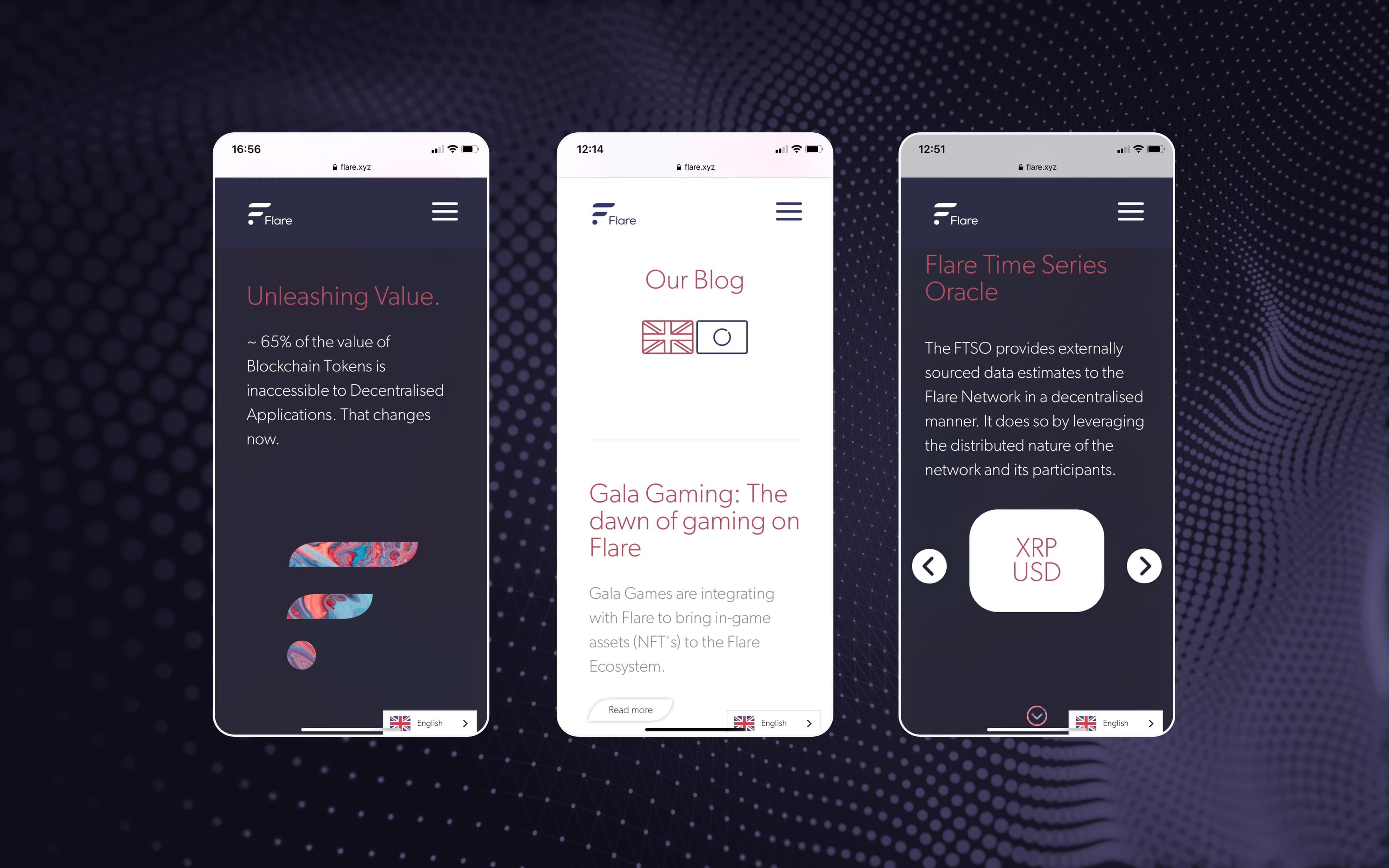
Rapid growth and keen international interest prompted Flare Networks to undergo a review of their digital presence, most pertinently in the form of their user-facing website and blog. Flare Networks came to Arch with solid design choices that emulated the brand values of sophisticated, clean technology, as well as a team that was able to fully manage the development of the site and updating once live it was launched. We found their existing website contained multiple brand motifs, including clean formatting, with extensive white space, visually setting them apart from their competitors. We also identified that a significant amount of their users come to the site via Twitter, and view it in a mobile aspect, meaning the design solution proposed had to place significant emphasis on being an equally stunning mobile experience as well as desktop.
The Solution
We designed and developed a ghost.org theme for easy implementation by the Flare team, incorporating the brand guidelines that had been set up by Flare, and further added to during the discovery process. The theme we created for them provided a single solution for both standard content pages, as well as their blog, a key area of the site used by potential Flare investors.
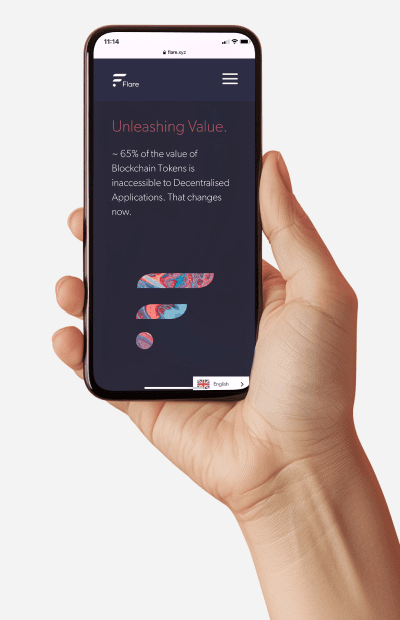
As a part of our work, we created for Flare a new website with a mobile-first, user-centred theme that upheld Flare’s unique online presence, and attention to a clean, visually appealing space.
Flare Network Features
Industry leading UX
Incorporation of scrolling animations such as parallax UX that culminates in an easy to navigate site
Uncompromising design
Light and Dark mode A digital identity that sets Flare apart from other organisations in their space
Accessible for all
A clean, simple to use, user-centred experience​ Multi-language translation
Flare Networks: Dark and Light Mode
Related Case Studies
mypensionID
We're working with mypensionID to streamline pension verification in the UK and connect people with t...
Study Buddy
FutureMe Study Buddy is a new education platform in partnership with further and higher education institutions...
VetNexa
We worked with Vet Nexa to bring to life an app designed to make the lives of veterinary professionals easier...
We'd love to chat about your project!
We're here to help. If you've got an idea or a direct need you would like help addressing, we're all ears!